
Inverted content and media for Auto Layout Carousel cards in 7.1
How to apply the "Content First" layout of Auto Layout Simple Lists to Auto Layout Carousels in Squarespace 7.1
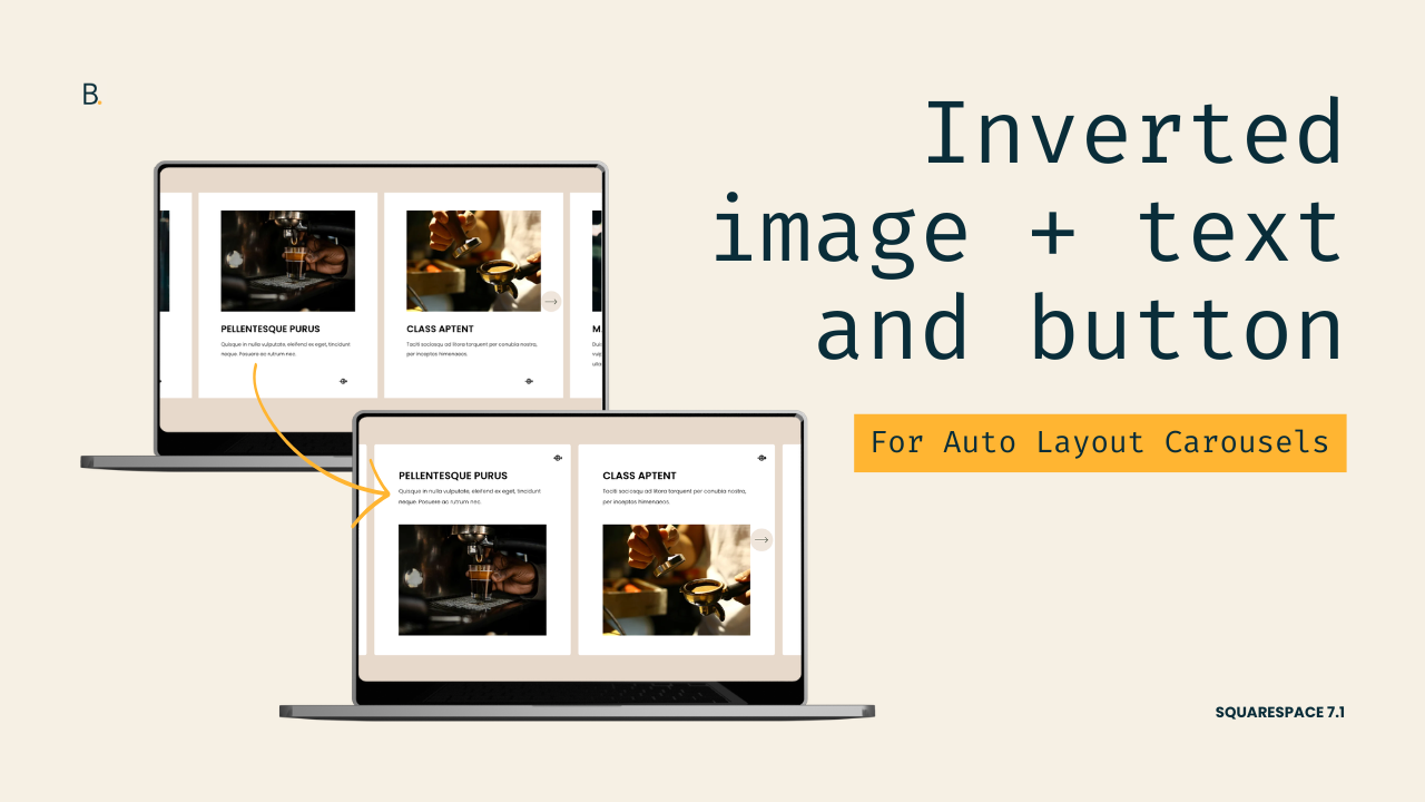
This tutorial demonstrates how to create an inverted Auto Layout Carousel design in Squarespace 7.1 by restructuring the order of carousel cards using Flexbox CSS properties. The process begins by reversing the position of the thumbnail and content areas through flex-direction: column-reverse, followed by reversing the order of the button and text content within the content container itself. Additional styling refinements include limiting the width of the text wrapper to match the media width, centering content with auto margins, manually adjusting spacing between elements, aligning content consistently using justify-content: start, and applying border-radius styling with overflow: hidden to prevent elements from extending beyond the card boundaries. The result is a fully responsive inverted carousel layout that maintains its styling across desktop and mobile views.
Today I want to share with you a few small tweaks you can make to Auto Layout Carousel cards on any client project.
So, if you’ve ever wanted to bring the “Content First” look of simple lists to the Carousel version, then this tutorial is for you!
You’ll learn how you can quickly invert the order of the content + media AND of the content + button element.
We’ll also look at some additional styling tweaks that can be applied to other elements on any site, including a trick that stops stuff from poking out through the rounded corners of your containers.
Let’s jump right into it!
Video timestamps
00:00 - Introduction
Alright, so let’s take a look at how you can build this inverted look for your Auto Layout Carousel slides in Squarespace. We’re going to build this in three steps. First, we’re going to invert the order of the content and the media. Second, we’re going to invert the order of the content and the button. Third, we’re going to add a couple of additional styles so that we can achieve this final look. If you want to follow along, you can use the settings that I have highlighted on the screen so that you can get the exact same result. And if you like the little icon that I have used for the button of the cards, you can grab that in the description box below. And with all of that out of the way, let’s go ahead and hop onto the code.
00:37 - Reversing the Media and Content Order
So the first thing we’re going to take care of is the order of the media and the content. The way that we’re going to flip this around is by using a very specific Flexbox property. That is because this content is already sitting within a flex container, so that’s already set up. The tweak that we need to make is going to take pretty much three lines of code.
So let me show you what that looks like. I’m going to open up here one of the list item cards, and you’re going to notice that we have two big elements. We have this one, which is the thumbnail area, and we have this one, which is the content area. Like I said, those two elements are sitting within this parent container that is already a Flexbox container. Then here on the right side, you can see that this has been set to a flex-direction of column. This is basically just stacking one thing on top of the other.
What we want to do is change that flex-direction value from column to column-reverse so that we have the same elements stacked, but in the reverse order. So to be able to target this container, I’m going to be grabbing one of its classes. I’m going to be using .list-item just because that class is shorter. Then, since I want to implement this customization only on this section, I’m going to be working with the Anchor Link that I already gave this section, which is called #invertedslides.
Now what we’re doing is changing that flex-direction value from column to column-reverse. Once we have that there, you can see how automatically now I have the content at the top and the thumbnail at the bottom. So step one is already completed.
02:28 - Reversing the Content and Button Order
Now let’s do the same thing for the content and the button.
Inside this list content area, we have two elements. We have one that is called .list-item-content__text-wrapper, which is holding both the title and the description, and then we have another one that’s called .list-item-content__button-wrapper, which is only holding the button.
So these two elements are sitting within the parent container that’s called .list-item-content, which is also a flex container. If we take a look here on the right side, we can see that this one also has that flex-direction property set as column.
We’re going to target this container, the .list-item-content, and in my case I’m going to target it for that specific section because I only want to make that modification for this area of my website. We’re going to do the same thing. We’re going to apply flex-direction: column-reverse.
And now we’re going to have the button at the top of the content, which in turn is on top of the thumbnail. As you can see, now we have steps one and two already complete, so it’s just a matter of adding a couple of extra modifications via CSS so that we can achieve the final look that I showed you in the beginning.
03:36 - Limiting Content Width and Adjusting Spacing
Now the first thing I’m going to take care of here is the spacing around the content. Because of how I want my button to stay here on the right side, completely aligned to the edge of the card, I’m not going to be using the Content Width setting that we have within the section. That is going to push inwards both the content and the button, and I want the button to stay where it is.
So instead, what I’m going to do is target the container that is holding both the title and the description, and I’m going to give it a max-width limit so that it matches the limit of the thumbnail underneath.
If we go back into the .list-item-content, you can see that this whole container holding the title and the description is called .list-item-content__text-wrapper. So that is the container that I want to target.
Now as I mentioned before, I want this to match the limit of the thumbnail, so what I would recommend doing here is using the same value that you have applied for the Media Width inside the settings as the value for the max-width of this container. So in my case, that is 75%.
To be able to center this, I’m applying a margin: 0 auto, which is going to help distribute the spacing between the two sides of that limited container.
Now one thing I’m noticing is that there’s not a lot of space in between the content and the thumbnail. Because we’re working with a layout that is not native to the section, we don’t really have an option to add a little bit of space down here. So I’m going to do this manually through this same snippet by adding margin-bottom: 3%.
That looks really good, but I don’t really like the alignment of the content right now. I’d rather have it aligned through the top of the titles instead of through the bottom of the descriptions.
05:14 - Aligning the Content to the Top
So I’m going to go back into my .list-item-content snippet, which is the one that is modifying the order of the button and the description. Inside this one, I’m going to be applying another Flexbox property called justify-content, and this one I’m going to set to start.
What this is going to do is make sure that all of the content is aligned to the top of that parent container instead of distributed within it or aligned elsewhere inside it.
So with that in place, you can see how now all of my titles are aligned through all of the different cards, and that just makes it look even better.
06:31 - Adding Border Radius and Fixing Overflow
Last but not least, I’m going to be adding a little bit of a border-radius to the cards. So I’m going to go back into my snippet where I’m targeting that .list-item, and I’m going to include a little border-radius here of 5px.
Once I do that, you can see how everything looks great, but there’s one quick thing that I want to note. If I were to make this a little bit bigger, say something like 50px, you can see how this corner is not quite rounding in full. We don’t really see that with 5px, but it’s definitely obvious if you’re going to be using a bigger radius.
So what’s happening is that this button that we have aligned to the top right corner of the card is currently overflowing the whole card. But because the background is white, we can’t really tell what part is what, but in any case, if you run into this type of issue when you’re applying a border-radius to any other element, the fix is to basically go into that same container where you’re applying the border-radius and also give this an overflow: hidden.
What this is going to do is crop anything that is within the whole container. So in our case, the content, the button, and the media. If anything is trying to go over that border-radius, it’s simply going to get cropped and you’re no longer going to have any edges coming out.
Now I have to admit that this overflow being visible creates a really cool look, but that’s not the one that I showed you in the beginning, so I’m going to go ahead and keep this as overflow: hidden and put this back as border-radius: 5px.
08:11 - Final Result and Mobile Preview
Now let’s go ahead and take a quick look here. Let’s save the changes, open this up, and then you can see how the same customization applies to all the cards. It looks great.
Then if we take a look at the mobile preview, everything just carries on here. We have everything looking great, nothing is overflowing, we have the border-radius applied, and we have everything in the exact same order that we have on desktop. The customization is completely done!
TL;DR
You can completely flip the look of your Auto Layout Carousel with just a couple of Flexbox changes
To reverse the order of the image + content you’ll need to swap flex-direction: column for column-reverse.
Then, to invert the order of the content and the button, you’ll need to do the same thing, but on the content container.
After that, if you want to limit the width of the content to match that of the thumbnail, you can apply a max-width to the text container.
Lastly, to create a border-radius that doesn’t allow stuff to poke out of it, you can use the overflow: hidden trick!
There you have it!
Now you know how you can flip the order of both the media and the content, or the content and the button, or both things at the same time for your Carousel Auto Layouts.
Until next time,
B.
Full code
Custom CSS Window
/*INVERTED CONTENT AND MEDIA FOR AUTO LAYOUT CAROUSEL CARDS IN 7.1*/
//Image reposition and card styling
#invertedslides .list-item {
  border-radius: 5px;
  flex-direction: column-reverse;
  overflow: hidden;
}

//Content reposition
#invertedslides .list-item-content {
  flex-direction: column-reverse;
  justify-content: start;
}

//Content width and spacing
#invertedslides .list-item-content__text-wrapper {
  margin: 0 auto;
  margin-bottom: 3%;
  max-width: 75%;
}