
Creating a boxed-in footer in Squarespace (Brine 7.0)

Let’s face it, the footer is the part of our Squarespace design we think about last when it comes to adding customizations.
However, that doesn’t mean we can’t show it some love and have it help our site look more custom by giving it a non-default style!
In today’s tutorial, we’ll be looking at how to create a super cool – yet super simple – boxed-in footer style, similar to that seen in some Showit and Shopify templates.
Ready? Let’s go!
Creating columns in your Squarespace footer
First of all, you need to make sure that the template you’re working with has 3 possible input sections inside the footer.
In this example I’m working with Brine, so I have the sections Top Blocks, Middle Blocks and Bottom Blocks. If you’re using one of these templates, make sure you to also have it set to stacked – and not column – inside your Style Editor.
Ok, now let’s start building our footer.
I’m going to add the content I want to showcase within each column to each of the sections (i.e. the content for the left column inside the Top Blocks section, the content for the middle column in the Middle Blocks section and the content for the right column in the Bottom Blocks section.
Here are the blocks I have for each section soon-to-be column:
Top blocks – heading 2 and Instagram block.

Middle blocks – logo image and a bit of text.

Bottom blocks – social icons block and a bit of text.

Alright, so let’s columnize (is that a word?) this thang!
We’re going to use the handy dandy flexbox properties for this.
So, first we have to find out what the CONTAINER that’s holding our 3 sections is called, and set it to flex.

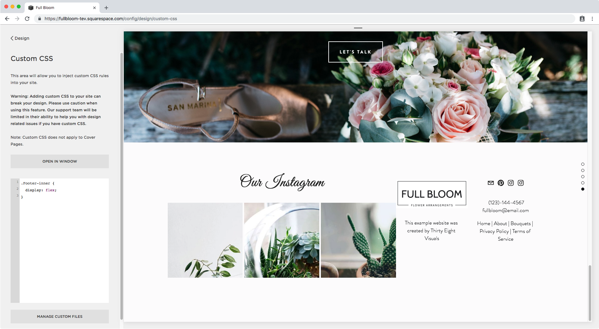
Ok! .Footer-inner it is since it’s the direct parent for all the other three sections.
Inside our magical Custom CSS window I’m gonna target it and set the display property.
.Footer-inner {
  display: flex;
}
We have our columns!
They look like crap right now but we’re going to be fixing them in just a second.
To do so, now we’re going to target all three individual sections and give them the ability to stretch as needed so they all fill out the same space.
First, let’s see what each section is called!
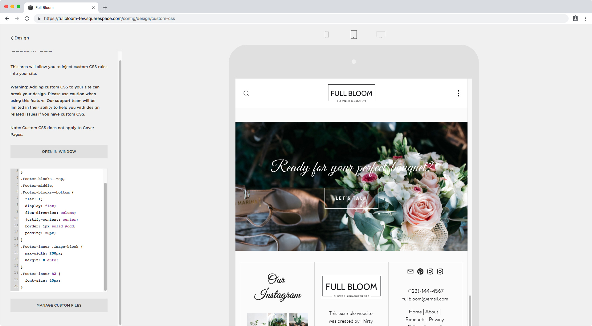
We have .Footer-blocks--top for the top one (amongst all those classes)…

….Footer-middle for the middle one…

…and .Footer-blocks--bottom for the bottom one.

Since we’ll be applying the same properties to all three, I’m going to group all the selectors and set the flex property to 1 which is the equivalent to setting flex-grow 1 and letting the other 2 parameters use fall into the default flex-shrink: 1 and flex-basis: 0 (you can read more about this here).
This will make our 3 columns stretch evenly to cover all the available space.
.Footer-blocks--top,
.Footer-middle,
.Footer-blocks--bottom {
  flex: 1;
}

Alright and now to align the content inside these columns, we’ll be making these flex and using the justify-content property to set the alignment.
.Footer-blocks--top,
.Footer-middle,
.Footer-blocks--bottom {
  flex: 1;
  display: flex;
  flex-direction: column;
  justify-content: center;
}

Perfect! Let’s add our border to the three sections to see what it looks like.
.Footer-blocks--top,
.Footer-middle,
.Footer-blocks--bottom {
  flex: 1;
  display: flex;
  flex-direction: column;
  justify-content: center;
  border: 1px solid #ddd;
}

Good, but how about some padding?
.Footer-blocks--top,
.Footer-middle,
.Footer-blocks--bottom {
  flex: 1;
  display: flex;
  flex-direction: column;
  justify-content: center;
  border: 1px solid #ddd;
  padding: 20px;
}

Ok, that’s looking great!
Next, I want to reduce the size of that logo so I’m gonna see what it’s called to target it.

Alright, I’ll use .image-block but since I only want to alter the image on my footer I’ll also make sure to use .Footer-inner like we did in the beginning.
.Footer-inner .image-block {
  max-width: 200px;
}

Aaaaaand let’s center it…
.Footer-inner .image-block {
  max-width: 200px;
  margin: 0 auto;
}

Nice!
Tweaking footer columns on mobile
Let’s check this baby on tablet mode.

The font of my H2 looks way too big here, so I’m going to make it a bit smaller overall – not just for smaller screens.
.Footer-inner h2 {
  font-size: 40px;
}
Much better! Now let’s see this on phones.

Ok, we have to fix this.
Instead of adding a media query to work around what we already did, I’m simply going to leave this to stack as it was doing originally by wrapping our current code inside a media query!
I will be doing this only for the snippets regarding the actual column-making process, so I will leave out the ones for the image and font size since I want those styles to display all the time.
@media screen and (min-width: 640px) {
  .Footer-inner {
    display: flex;
  }
  .Footer-blocks--top,
  .Footer-middle,
  .Footer-blocks--bottom {
    flex: 1;
    display: flex;
    flex-direction: column;
    justify-content: center;
    border: 1px solid #ddd;
    padding: 20px;
  }
}

So now in phones, our three columns will stack and then on desktop we will still have them neatly side by side!

Adding other blocks to your footer
The cool thing about this customization is that you can use pretty much any block you want!
Take a look at this example switching the IG block for a newsletter block with floated fields:

It looks beautiful and it’s still completely aligned with the other 2 columns!
However, make sure that you always check what things look like in the other two screen previews since you may need to adjust something else for the particular block you’re using.
In this case, there’s a slight issue in tablets: the email field is too long.

If we look at it through Inspect Element, we can see that the problem is the field has a minimum width of a set amount of pixels, so we need to overwrite that to make sure it doesn’t go beyond the column.
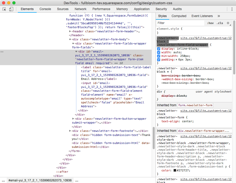
I’ll be using the selector that’s ready for us on the right-hand side of the window and make sure to indicate the changes should be applied to the field located inside the footer, and nowhere else on my site.
.Footer-inner .newsletter-block .newsletter-form-field-wrapper {
  min-width: 0;
}

Alright and then in phones…

Awesome! It looks great.
So there you have it! Now you can create a simple boxed-in footer in Squarespace, to make your template look more custom.
Until next time,
B.
Full code
@media screen and (min-width: 640px) {
  .Footer-inner {
    display: flex;
  }
  .Footer-blocks--top,
  .Footer-middle,
  .Footer-blocks--bottom {
    flex: 1;
    display: flex;
    flex-direction: column;
    justify-content: center;
    border: 1px solid #ddd;
    padding: 20px;
  }
}