
Custom button for Portfolio items in Squarespace 7.1
How to add buttons to Portfolio items in Squarespace 7.1?
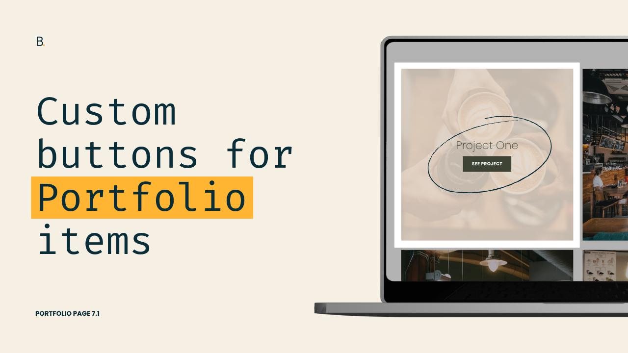
This tutorial demonstrates how to add a fully customizable button to Portfolio grid items in Squarespace using pure CSS and pseudo-elements. The button is created using an ::after pseudo-element attached to the .portfolio-text container, allowing it to display directly below the Portfolio title. The tutorial works for both Overlay and Simple Portfolio layouts. Two styling approaches are covered: Manually defining all button values (background, typography, spacing, etc.). Reusing Squarespace’s built-in CSS variables from existing button styles to ensure the custom button dynamically updates when Site Styles change. The second method is especially useful for client projects, as it prevents future maintenance issues when branding adjustments are made.
Not a fan of the missing button option for Portfolio pages in 7.1? Me either.
Let’s work around that limitation and implement one anyway, shall we?
In this tutorial, we’ll look into how to create fully custom Portfolio buttons using CSS, control exactly where they appear inside the Portfolio items, and even match existing Squarespace button styles using built-in variables to keep their look adjustable through the Site Styles panel!
Ready? Let’s do it.
Video timestamps
00:00 - Intro & customization overview
This customization will work with both the Overlay and Simple Grid layouts, however I’ll be using the Overlay option with “Before Hover” enabled to see what we’re doing.
00:24 - Looking for an anchoring element in the Inspector tool
Since we’re creating our button just with CSS, we’ll need a pseudo-element and, therefore, an existing element on the page to anchor it to. That’s what we’ll look at here.
01:04 - Creating the custom button via CSS
After being clear on how narrow or global we’re going with our modification, it’s time to create our button. Depending on what you want it to read, you can use any text or unicode symbol you want.
03:08 - Styling the button with manual values
With the content in place, we can then move forward with the actual styling. We’ll set a background color, a font color, and a few other style tweaks to make it match the rest of the site’s brand.
05:12 - Styling the button with variables to match an existing button
Last but not least, I’ll show you an alternative way to set those values, if what you’re trying to do is keep the button as user friendly as possible, so that when you alter the styles inside the Site Styles panel, the new coded button gets updated too.
TL;DR
This customization will work with both the Simple and Overlay Grid Portfolio layouts, however I’ll be working with the latter.
In order to create the button, we’ll need to use a pseudo-element attached to another element of the items.
Using the title element as the anchor will allow us to position it where we want it, AND ensure it’s clickable. So, that’s what we’ll be targeting in our code.
Depending on how global you want to apply the change, it may be necessary to narrow down your selector by replacing the #gridThumbs ID with a portfolio layout class, data-section-id, or page ID.
Once our new button is in place, we can style it by setting our own property values.
However, it’s also possible to use variables from another button, to mimic its style and have control over the values through the Site Styles panel.
And that’s all there is to it!
As I mention in the video, this route is best for when you’re trying to create a new button design that stands out from the native ones. Or, for when you want to mix and match fixed values with existing variables.
However, if you ever want to automate the process by simply calling out the type of button you want to use as the “style guide”, you can check out this plugin inside The Snippet Directory.
Hope this helped!
Until next time,
B.
Full code
Custom CSS Window
/*CUSTOM BUTTON FOR PORTFOLIO ITEMS IN SQUARESPACE 7.1*/
#gridThumbs .portfolio-text {
  align-items: center;
}
#gridThumbs .portfolio-text::after {
  background-color: white;
  border-radius: 100%;
  color: var(--secondaryButtonBackgroundColor);
  content: 'See project';
  display: block;
  font-family: var(--secondary-button-font-font-family);
  font-size: .9rem;
  font-weight: var(--secondary-button-font-font-weight);
  margin-top: 10px;
  padding: 1em 2em;
  text-transform: var(--secondary-button-font-text-transform);
}