
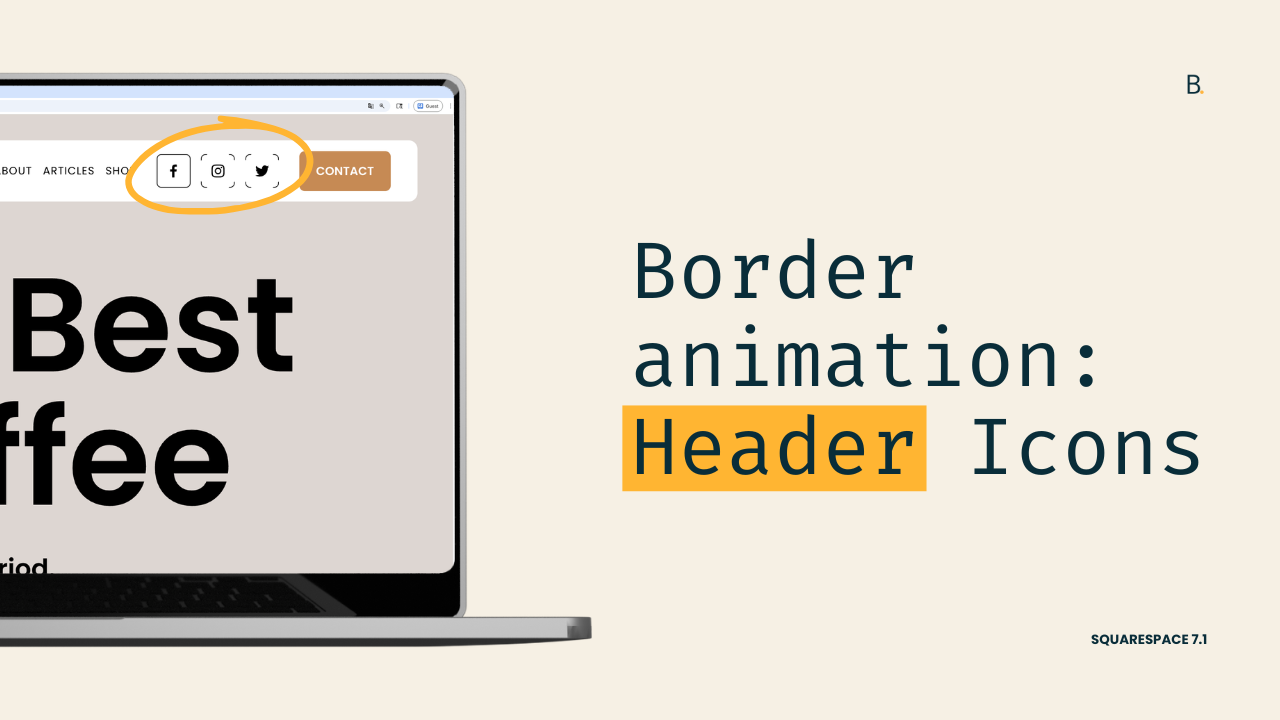
Header Social Icons border microinteraction for Squarespace 7.1
Header social icons hover mode effect for Squarespace 7.1
This tutorial walks through how to build an animated hover microinteraction for Squarespace 7.1 header social icons using CSS. Instead of truly drawing the border, the effect relies on a pseudo-element shaped like a diamond that hides parts of the border until hover. On interaction, the diamond scales down (and optionally rotates), revealing the full border and creating the illusion of the outline being drawn. The tutorial also covers how to properly center transformed elements, apply smooth transitions, and use Squarespace’s built-in CSS variables so the effect automatically adapts to header color changes.
Ready for a fun hover customization?
In this tutorial, we’ll look into adding a cool “drawing” animation (or microinteraction) to the Header Social Icons in Squarespace 7.1.
There are a couple of elements that need to be in place in order to set this up, but there’s nothing too crazy required.
The actual animation-building part is somewhat advanced but totally doable.
Plus, along the way I share some quick variable tips you may find helpful for other client projects so, overall, it’s a juicy one.
If you’re up to spending a few minutes adding code to create this border hover mode, let’s not waste any more time and jump right into it!
Video timestamps
00:00 - Microinteraction Overview
Okay so let's take a look at how we can achieve this microinteraction for the social icons in the header of Squarespace 7.1.
Now keep in mind that this is an illusion. We're not really going to be drawing the border of the icon, we're just going to make it look like that's what's happening.
On the Live site it looks like the four corners of that border are sort of stretching out to meet the other ones inside that square, but what's actually happening is something different.
00:17 - How the Illusion Works
We have an extra element in there covering those parts of the border that we don't want to see on load.
And then on hover what's happening is that that diamond is reducing its size and therefore it's allowing us to see the rest of the border.
So in order to achieve this illusion we need to have a couple of things in place. We need to work with the social header icons that don't have any sort of border applied to them, a large icon size and one final thing (and this is very important ) this customization is going to work for those header styles that have a background applied to them. Otherwise you're going to see the trick behind the illusion.
Alright so with all of that out of the way let me show you what I have already set up in here in the code, and then we're going to jump into how to create the actual hover mode.
00:36 - Setup Overview and Targeting Icons
So this initial icon setup that I have here is just meant to create the border that we're going to be using in our customization.
So I have mine set up as 1px because I want it to be fairly thin. I have it set to solid, and then instead of using a regular hex code or RGB color I'm using the variable instead that Squarespace uses to apply the color for the links inside the header.
Now the other thing that I have in place is a border-radius of 5px, and I also have a couple of Flexbox properties in here just to make sure that the icon stays in the middle of that container.
Because the other thing that I'm doing in order to create enough space or enough separation between the icon and the edge of the border is to reduce the size of the SVG itself.
So that's why I said in the beginning that it's easier to work with a larger number because if you were to reduce the SVGs to 50% and you're working with something like 20 pixels then you're gonna have really really tiny icons.
Now apart from that the other thing that I added in here was the position of relative and the z-index of 10 because of how we're gonna set up the trick.
We're gonna do this in three steps.
First we're going to look for a container that we can target inside the HTML where we can attach that new element.
Second we're going to set up the initial state that that diamond is going to have which is what we're going to see on page load.
And third we're going to create the hover mode that is going to make changes to that diamond so that we can actually get that final animation.
So let's start by looking at how we can target these icons.
01:11 - Pseudo-element and Initial Setup
Each of these icons is an <a> element and they all share the same kind of classes.
I'm going to target these through the class of .header-icon and then because I only want this customization to apply to desktop I'm also going to be including another class that belongs to a parent container that tells the browser that this should only apply on desktop.
Let's go ahead and set up our selector down here.
Now we're going to be creating a pseudo-element that is going to be our diamond, so I'm going to be creating here a ::before pseudo-element.
And as always the first thing we need to do with a pseudo-element is give it a content property.
Now I'm going to keep this one empty because what I want to do is create an empty container that only has a background color.
So once I have that there I'm going to set the height and the width of this element.
And because I want it to overlap with the SVG icon I'm going to set this to position: absolute, and for now I'm going to align it to left: 0 and top: 0.
Now at the moment we're not really seeing anything so let's give this a quick background-color so that we can see what's going on.
Alright perfect.
02:25 - Building and Centering the Diamond Shape
So now that we tackled this first part let's go ahead and set up the initial state of the diamond first.
We need to rotate it because right now it's just a rectangle, so let's use transform: rotate(45deg).
And just like that we have our diamond.
In fact if I were to set this up as white now we get that initial state for the icons. We have a little bit of the border sort of erased from the screen even though we already know that's not what's happening.
Now you could absolutely work with the diamond as it is right now, but I actually want to show you how you can make the diamond a little bit bigger in case you wanna have smaller corners on page load.
So to be able to make this diamond bigger we need to do a couple of things.
First we need to edit the height and the width and keep in mind that this height and width is in reference to the whole icon container.
So 100% is 100% of the height and the width of that little square.
So using that as a reference if you wanted to make it a little bit bigger we could do something like 110% or 120%.
Now doing that let's put this back as red, you're going to see how the diamond is no longer in the middle of the container.
So to be able to center this again if you're going to be using a number that's different from 100% what you need to do is modify the position of the element.
So we're gonna do that by setting top and left as 50% and then going into the transform property and using the translate trick.
So translate(-50%, -50%).
Let's change the color of this element back to white, and you can see how the corners are now smaller than they were before.
03:34 - Creating the Hover Mode
Now once you're happy with how much of the corners are actually showing up in your icons then we can move on to Step 3 which is creating the hover mode.
Now to create the hover mode we're going to be using the same container where we're attaching our pseudo-element as the trigger for it.
So here is where we get to decide what happens to that diamond.
In the demo that I showed you what I'm doing is simply reducing the size of that element and I'm doing that through the transform property once more using the scale function.
So here we're going to keep the translate as -50% and -50% because we don't want the diamond to move from where it is.
We're going to keep that rotation of 45deg but we're going to add in a scale( ) of zero.
And once we do that you can see that if we stand over this container we pretty much get the border showing up.
Now right now it looks a little bit clunky because we haven't set up a transition to change from that transform translate rotate to transform translate rotate and scale so let's do that really quickly here.
We're going to set a transition that is going to affect the transform property. We're going to set this to .5s but you can adjust that to your liking.
And now you can see how that diamond is becoming smaller and therefore allowing us to see the rest of the border.
05:31 - Modifying the Effect
If I were to change the color of this again you can see it more clearly.
So if I go into that icon you can see how again it's just a matter of the diamond reducing in size and pretty much disappearing from the screen.
Now the cool thing about this effect besides the fact that it's cool on its own is that you can actually keep modifying things.
So let's say that for example we don't want the diamond to just scale, we actually want it to rotate.
I'm gonna set this to 360deg and then what's gonna happen is that the diamond is still going to shrink down because we kept the scale of zero but it's also going to rotate at the same time.
So now if I put this back as white to blend in with the header background then we get this effect where it looks like the border is sort of drawing across the entire, this is kind of weird, but it's drawing alongside the whole container.
It's not just matching corners with corners.
08:08 - Final Tip: Using Header Variables for Colors
Now before we wrap this up I have one additional tip for you.
If you want to make sure that the element has the same color that the solid header has regardless of if you decide to change it later on, what you can do is work with the same color variable that Squarespace is using to set up the color of the header.
So let me show you where you can find that here.
If we go all the way up to the <header> element, so here you can see that this is the whole <header> element. You're going to notice that on the right side we have a couple of variables.
These are the ones that Squarespace is using for the header specifically based on the different colors that you have set through the color themes or through the header settings.
So here in this case what we can use is this solid header background variable.
You're going to see that if I were to change this to a different color that changes the color of the header.
So what we can do is grab that variable and use that in here in our CSS inside the parenthesis.
And now if we were to change the color of the header the color of that square element is also going to be modified without you having to hop back into the code.
TL;DR
Start with the borderless social icon option, a fairly large icon size and a solid header background.
Set up the border, border radius and icon size through the initial icon setup code.
Use the .header-icon container to attach the ::before pseudo-element we’ll need to create the effect.
Give it some basic size and position properties, a background color of your choice and set it to rotate(45deg) through the transform property. Adjust the size of the shape as needed, depending on how small you want the initial border corners to be.
Target the :hover mode of the same .header-icon container to apply the sizing change the diamond should have through the scale( ) function.
Apply a transition to make the change smoother.
Optionally, add an extra rotation to the hover state and/or use the solid header background variable to set up the diamond’s color, to avoid changing it manually in the future.
I really hope that you enjoyed this one. I had lots of fun creating!
Until next time,
B.
Full code
Custom CSS Window
/*HEADER SOCIAL ICONS BORDER MICROINTERACTION FOR SQUARESPACE 7.1*/
//Initial icon setup
.header-display-desktop {
  overflow: hidden;

  .header-icon {
    align-items: center;
    border: 1px solid var(--solidHeaderNavigationColor);
    border-radius: 5px;
    display: flex;
    justify-content: center;

    svg {
      height: 50%;
      position: relative;
      width: 50%;
      z-index: 10;
    }
  }
}

//Initial hover mode state
.header-display-desktop .header-icon::before {
  background-color: var(--solidHeaderBackgroundColor);
  content: '';
  height: 120%;
  position: absolute;
  left: 50%;
  top: 50%;
  transform: translate(-50%, -50%) rotate(45deg);
  transition: transform 1s;
  width: 120%;
}

//Hover mode
.header-display-desktop .header-icon:hover::before {
  transform: translate(-50%, -50%) rotate(45deg) scale(0);
}