
Styling the related video items in Squarespace’s video pages (7.1)
If you’re working with video pages in your 7.1 projects, it’s very likely that you want to customize the look of some of its areas a little bit.
If that’s the case, then this tutorial is for you!
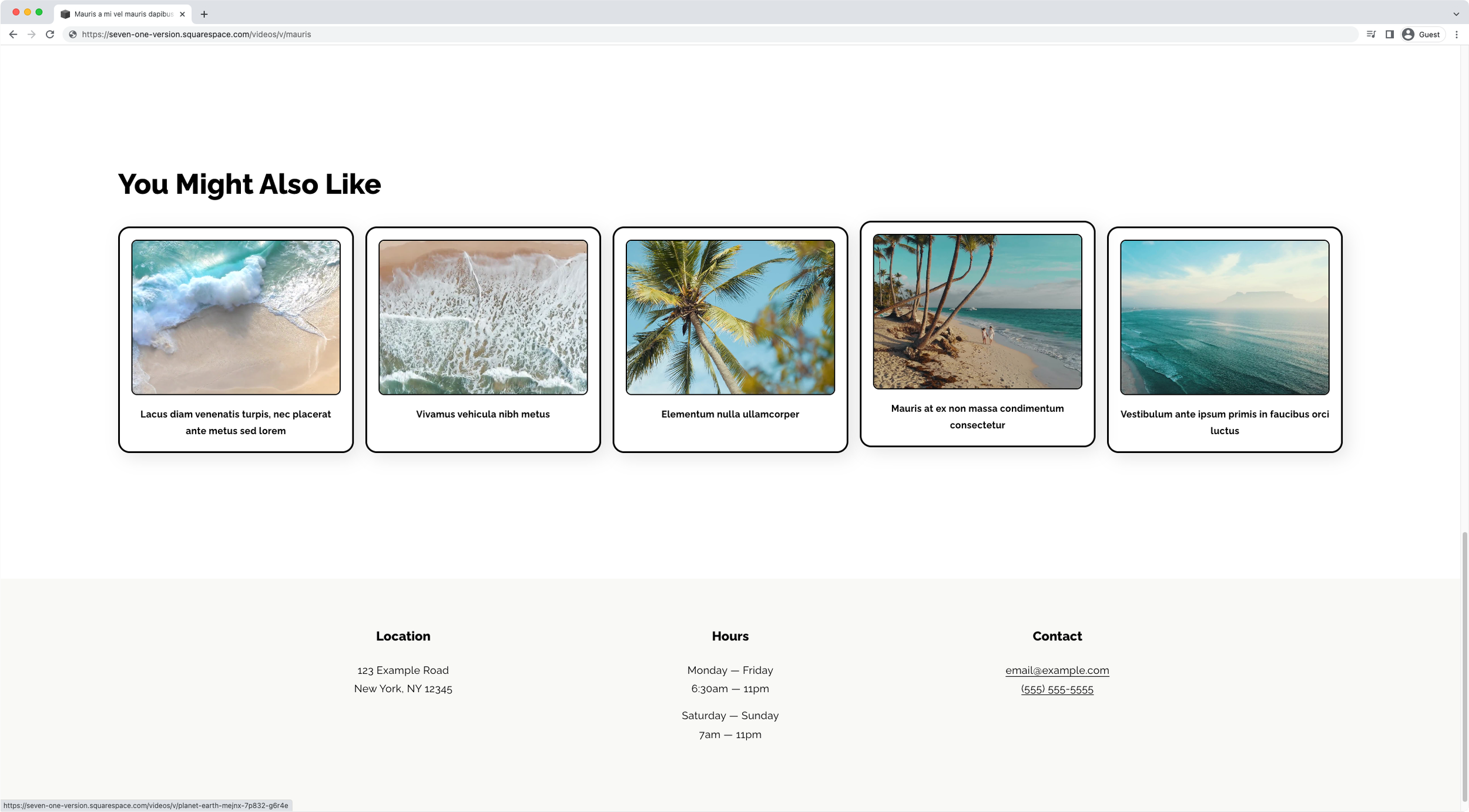
We’ll be tackling how to create a simple polaroid style for the Related Videos section at the bottom of the individual video pages.
So, if this is something you’re hoping to customize for your clients, jump over to the tutorial to see how you can make it happen!
Tutorial
Overview & timestamps
Let’s get our retro groove on!
00:00 - Intro
01:00 - Inspecting the related videos area to pick a target container
We’ll start out by looking through the different containers available inside the related items section to see which one we can pick to create our polaroid-ish container.01:50 - Building the initial selector
Once we find something we can work with, we’ll create our selector to make sure we’re ONLY modifying these related items within video pages, and nowhere else.03:04 - Styling and spacing out the related video items
Next up, it’s time to add our initial styles! We’ll begin by adding a bit of a border and rounded corners, as well as adding a gap, creating a bit of space between the related items so that they don’t look all smooshed together.05:08 - Styling the related video items thumbnails
After we’re done with the outer container, we’ll move onto adding the same border and a bit of a border-radius to the thumbnail container, making sure the corners of the image are hidden or cropped behind the rounded corners.06:34 - Styling the related video items title
Moving onto the little title underneath the image, we’ll take a look at the best way to override the original font-size code and add some extra styles to the text to make it pop more.08:32 - Quick tip to tackling text-align: center issues
To be able to center-align the text tho, we’ll run into a little issue. Very briefly, we’ll look into what’s happening and how we can fix the problem for the related items we’re customizing, as well as for any other situation where the same problem may arise!09:49 - Spacing out the thumbnail from the title for related video items
We’ll finish up our styling here by creating a bit of separation between the thumbnail image and the text.10:05 - Creating the hover mode
Alright, now it’s time to create our hover mode for the related video items! We’ll keep things simple by creating a slide-up effect through the transform property, and add a little bit of a transition to make the animation smoother.12:27 - Checking and fixing mobile issues
Before we wrap things up, we’ll take a quick peek at mobile and see that everything’s pretty messy on smaller screens. So, we’ll need to make a couple of changes to recreate the spacing we had on desktop, by including some padding and some margin, as well as fixing a very common overflow issue that can come up when applying padding to a container that didn’t have any.
Alrighty, and that’s all there is to create a simple but lovely polaroid style look for related video items in Squarespace.
Keep in mind that you can always use this as a base to create your own customization, have fun with it!
Until next time,
B.
Full code
/*STYLING THE RELATED VIDEO ITEMS IN SQUARESPACE'S VIDEO PAGES (7.1)*/
//Creating a gap between related item
.lesson-item .lessons-item-related-item-list {
  grid-gap: 20px;
}

//Styling the related items
.lessons-item-related-wrapper .lessons-item-related-item-list .related-item {
  background-color: white;
  border: 3px solid black;
  border-radius: 20px;
  box-shadow: 8px 8px 30px rgba(0,0,0,0.1);
  box-sizing: border-box;
  margin: 15px 0;
  padding: 20px;
  transition: transform .3s;
}
.lesson-item .related-item-link-thumbnail {
  border: 2px solid black;
  border-radius: 10px;
  overflow: hidden;
}
.lessons-item-related-wrapper .lessons-item-related-item-list .related-item .related-item-link-text {
  display: block;
  font-size: 16px;
  font-weight: bold;
  margin-top: 20px;
  text-align: center;
}

//Hover mode
.lesson-item .related-item:hover {
  transform: translateY(-10px);
}