The Codebase
Filter through all the code
Find the Squarespace tutorial, plugin or snippet that’s going to help you fix or customize your client’s site in a heartbeat.
Stacked masonry slides on mobile (7.1) - Gallery Section Grid Masonry
Loving the look of your 7.1 Masonry Gallery Section on desktop, but wish you could stack the slides on mobile? Well, it’s your lucky day! This snippet will help you tweak that aspect of your galleries in one quick copy/paste action. You’ll have the ability to decide at which breakpoint the stacking happens, and adjust the space between slides as well. Everything else will be taken care of automatically.
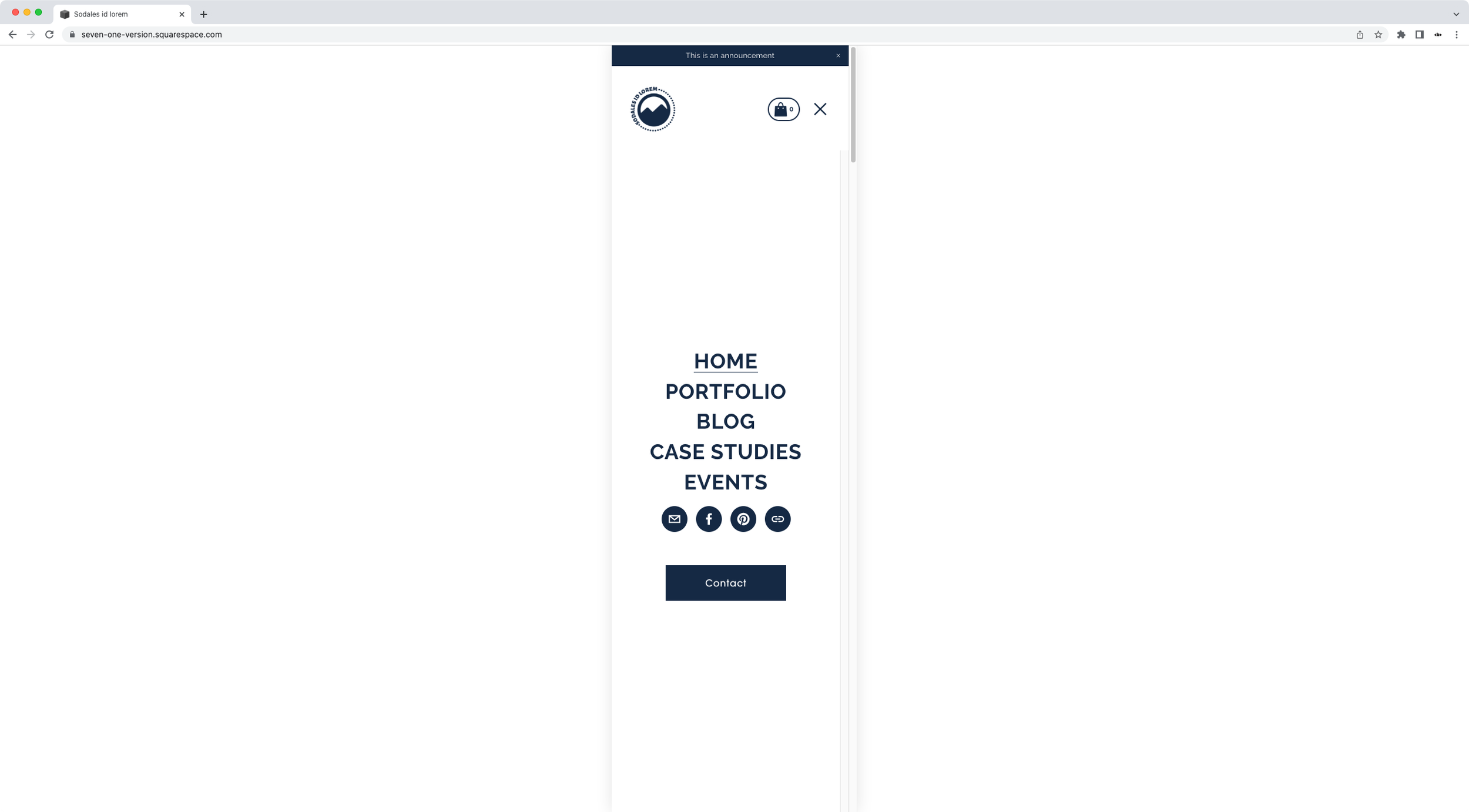
Alternate logo for open mobile menu - Header nav (7.1)
If you're working with a different color theme for your 7.1 site's overlay menu and you need to change your logo color to make it pop, this is the code snippet for you!
Mobile nav on demand - Header nav (7.1)
Wishing you could bring up the burger button and mobile menu on tablets in your 7.1 site? Wish no more with this handy little snippet! Copy/paste this code into your Squarespace site and you’ll be able to have the mobile nav instantly show up at the breakpoint of your choice, to either avoid frustrating issues with excess nav links on tablet-ish devices or simply create a minimal look on desktop!
Change the number of thumbnails per row on mobile for Portfolio pages set to Grid layout (Simple & Overlay) (7.1)
In this tutorial, I'll be showing you how you can easily control how many thumbnails/images/slides per row show up in your 7.1 Portfolio pages on mobile, when working with the Grid: Simple or Grid: Overlay layout
Moving the mobile menu button in Squarespace closer to the links (7.1)
In today’s tutorial, we’ll be looking into how we can bring the button inside the mobile nav of Squarespace 7.1, closer to the links!
How to reduce the height of the Gallery Slideshow Reel on mobile in Squarespace (7.1)
Gallery Reels can be a pretty easy way to create an immersive image carousel in your client's site, but on mobile they may show up taller than what you have in mind. Luckily, today, you’ll find out how you can quickly change that!
Changing the number of slides per row for Squarespace Auto Layouts on smaller screens (7.1)
Let’s take a look at how we can control the number of items displayed on mobile when working with the Auto Layout List in Squarespace 7.1!
How to create responsive text, WITHOUT media queries, in Squarespace (7.0 & 7.1)
In today's video, we'll be tackling how to handle responsive text in Squarespace with ONE line of code and no media queries. Take a look!
Custom burger button for mobile (Brine 7.0) - Header nav
If you’re looking to go the extra mile with your site’s customization and be able to use your own custom burger button in Squarespace 7.0 (Brine family), this is the snippet for you! You’ll be able to replace the native lines in no time and showcase your branded version by simply using the image’s URL.
Custom burger button for mobile (7.1) - Header nav
If you’re looking to go the extra mile with your site’s customization and be able to use your own custom burger button in Squarespace 7.1, this is the snippet for you! You’ll be able to replace the native lines in no time and showcase your branded version by simply using the image’s URL.
Keeping horizontal layout on mobile (7.0 & 7.1 CE) - Image Block Card
Depending on how you’re using Card Image Blocks, you may be looking into how to keep the content and the image in a horizontal layout at all times. If that’s the case, this code snippet is for you! With a quick copy/paste you’ll be able to maintain everything side-by-side even on smaller devices, and control the width each part should have.
How to adjust your page/index section height on mobile (7.0 & 7.1 CE)
If you like creating really immersive designs for your clients, chances are you love setting your index sections (7.0) or page sections (7.1) to the full height of your screen. The effect looks amazing on desktop but, on smaller screens, that extra space can be a little bit too much…
How to align footer text to the center in mobile screens (Brine 7.0)
Have you ever wanted to center-align text inside your footer in smaller screens while keeping it left or right-aligned in tablets and desktop? The process and code are quite simple BUT, particularly when you originally have text aligned to the right there are additional steps required to have full control over the mobile result.
Controlling gallery block grid images per row in mobile (7.0, 7.1 CE & 7.1 FE)
I want to walk you through a nifty little CSS trick that you can use to rearrange your gallery block grid images in smaller devices, so you can choose how many thumbnails or slides to display per row!
How to remove automatic hyphens in Squarespace (7.0 & 7.1)
When I talked about changing the size of mobile fonts in Squarespace at the very end of the post I gave you a quick tip on how to turn off automatic hyphenation. However, I wanted to do a separate post about it since there are some things you should…
Change the size of mobile fonts in Squarespace (7.0, 7.1 CE & 7.1 FE)
Not feeling happy with how Squarespace is resizing your fonts in mobile? Then let's do something about it shall we? In today's quick tutorial I'm going to show you how you can easily change the size of your fonts in mobile view. Let's go!


