
The
Snippet Directory
A curated collection of versatile snippets for Squarespace designers, aimed to help customize client projects in a fraction of the time.
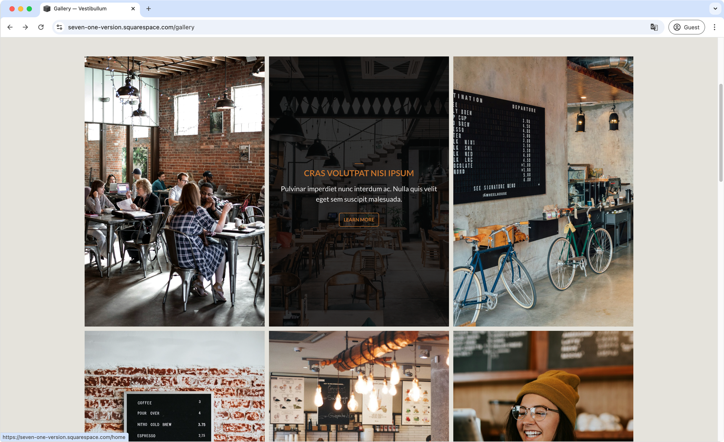
Content overlay on hover - Gallery Block Grid
If you’re using a Gallery Block Grid in your 7.0 or 7.1 client project, and wish you could create a hover content overlay on top of the thumbnails, look no further. This plugin will help you achieve the look you’re going for, while giving you tons of settings to style the title, description and link fonts, as well as spacing and colors, to make sure the design blends in or stands out as much as you want. Plus, you’ll have the option to decide when the stacked mobile layout kicks in (if at all) and what it looks like, separate from the desktop version.

Stacked masonry slides on mobile (7.1) - Gallery Section Grid Masonry
Loving the look of your 7.1 Masonry Gallery Section on desktop, but wish you could stack the slides on mobile? Well, it’s your lucky day! This snippet will help you tweak that aspect of your galleries in one quick copy/paste action. You’ll have the ability to decide at which breakpoint the stacking happens, and adjust the space between slides as well. Everything else will be taken care of automatically.

Related videos aspect ratio and title adjustments - Video page (7.1)
Not a fan of the native aspect ratio for Related Videos thumbnails in Squarespace 7.1? Kinda wish you could quickly adjust the titles under them too? Well, guess what? You’ll be able to have full control over both parts of that element with this one code snippet! Modify the font family, size, weight, alignment, color, etc of those related titles in a single swoop, and give the thumbnails whichever aspect ratio you prefer with a simple value change!

Ripple icon card style - Auto Layout Carousel (7.1)
Give your project’s Auto Layout Carousel cards a subtle but dynamic hover effect with this snippet! In under 5 minutes, you’ll achieve a cool ripple effect behind the icons when hovering over the corresponding expanded button. Through the code, you’ll get to control the border styles, rounded corners, icon background and ripple color, icon size, title styles and button styles with ease, while still having the ability to use the section’s native options to adjust the spacing and font sizes to match your design.

Ripple icon card style - Auto Layout simple list (7.1)
Give your project’s Auto Layout Simple List cards a subtle but dynamic hover effect with this snippet! In under 5 minutes, you’ll achieve a cool ripple effect behind the icons when hovering over the corresponding expanded button. Through the code, you’ll get to control the border styles, rounded corners, icon background and ripple color, icon size, title styles and button styles with ease, while still having the ability to use the section’s native options to adjust the spacing and font sizes to match your design.