
Squarespace 7.1 Auto Layout Lists: Spotlight Hover Effect
How to fade other cards on hover in Squarespace 7.1 Auto Layouts?
This tutorial walks through how to create a two-level spotlight hover effect for Auto Layout Simple Lists in Squarespace 7.1 using CSS only. The effect works by:
- Creating an ::after pseudo-element overlay on each card
- Positioning it using position: absolute while anchoring to the card via position: relative
- Applying a semi-transparent background color
- Using pointer-events: none to prevent click interference
- Setting default opacity: 0 for hidden initial state
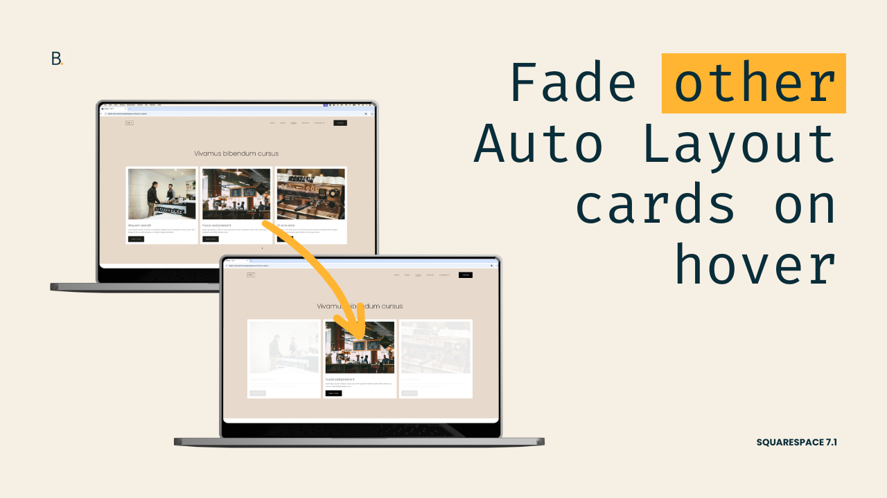
There are a few different ways to add effects and dynamic interactions to Auto Layouts (and we’ve covered several of them on the blog), but today we’re focusing on a quick but impactful one: a spotlight-style hover effect that subtly fades out all cards while bringing the hovered card back into focus!
This customization is built entirely with CSS, and doesn’t rely on any special section settings. So, it’s super flexible and versatile as both a final result and a starting point to build out of.
In the tutorial, I’ll be walking you through how to implement it for the Simple List layout, but you’ll find the code for the Carousel version as well at the end of this post.
So, without further ado, let’s get to it!
Video timestamps
00:00 - Intro & effect overview
We’ll start by taking a quick look at the final spotlight hover effect so you can clearly see what we’re building. When hovering near the cards, all items fade slightly, while hovering a specific card, its full opacity returns.
02:10 - Targeting the Auto Layout List structure
Next, we’ll hop into the Inspector Tool to identify the correct container and list item selectors. We’ll focus on the .user-items-list-simple structure and talk through how you can keep the selector global, or narrow it down to specific sections using IDs or Anchor Links if needed.
05:00 - Creating and positioning the overlay
With our selector in place, we’ll create the overlay using a pseudo-element. We’ll anchor it to each card, position it correctly, and make sure it covers the entire card area.
08:05 - Initial state and first hover level
With the overlay in place, we’ll set its default state so it’s hidden on page load. Then we’ll make sure it doesn’t block the card's clickability features and, finally, create the first hover step: fading all cards when the bigger container is hovered.
11:20 - Second hover mode
Last but not least, we’ll complete the spotlight effect by overriding the fade on the hovered card itself, bringing it back to full opacity. We’ll add a subtle transition to smooth everything out, and we'll have our complete hover mode ready to go!
TL;DR
We’ll begin by breakdown the final result and noticing there are 2 hover modes at play: one when hovering near the cards, and another when hovering over a specific card.
To create the look, we’ll attach an overlay pseudo-element to each card and then change its opacity based on what we’re hovering.
The initial state will keep the overlay completely hidden, and then the first hover mode will make it visible again when we touch the bigger container holding ALL cards.
Then, we’ll create the second level of the hover mode, where when having the cursor over a specific card, the overlay gets its opacity modified once more.
Lastly, we’ll add a transition to make the change smoother and we’ll be done.
That’s it!
From here, you can take it one step further and keep making other style adjustments or call it a day and move on to the next part of your project.
In any case, I hope you found this helpful!
Until next time,
B.
Full code
Auto Layout Simple List
Custom CSS Window
/*AUTO LAYOUT CARD SPOTLIGHT EFFECT (LIST)*/
.user-items-list-simple {
  .list-item {
    position: relative;
  }
 .list-item::after {
   background-color: rgba(255, 255, 255, 0.9);
   content: '';
   height: 100%;
   opacity: 0;
   pointer-events: none;
   position: absolute;
   left: 0;
   top: 0;
   transition: all .5s;
   width: 100%;
   z-index: 1;
 }
}

//Hover mode
.user-items-list-simple:hover {
  .list-item::after {
    opacity: 1;
  }
  .list-item:hover::after {
    opacity: 0;
  }
}
Auto Layout Carousel
Custom CSS Window
/*AUTO LAYOUT CARD SPOTLIGHT EFFECT (CAROUSEL)*/
.user-items-list-carousel__slides {
  .list-item {
    pointer-events: auto;
    position: relative;
  }
 .list-item::after {
   background-color: rgba(255, 255, 255, 0.9);
   content: '';
   height: 100%;
   opacity: 0;
   pointer-events: none;
   position: absolute;
   left: 0;
   top: 0;
   transition: all .5s;
   width: 100%;
   z-index: 1;
 }
}

//Hover
.user-items-list-carousel__slides:hover {
  .list-item::after {
    opacity: 1;
  }
  .list-item:hover::after {
    opacity: 0;
  }
}