
Custom arrows for Summary Block Carousels in Squarespace
How to use custom arrows for Summary Block Carousels in Squarespace?
This tutorial demonstrates how to replace the default Summary Block carousel arrows in Squarespace with custom image files using CSS. We begin by inspecting how Squarespace generates the arrows and discover that they are created using ::before pseudo-elements with unicode chevron characters. While simply swapping unicode characters is possible, this tutorial focuses on replacing them entirely with image files. The approach involves:
- Applying custom arrow images as background images on the arrow container elements
- Hiding the original pseudo-element chevrons by reusing Squarespace’s existing selectors for proper specificity
- Manually defining height and width on the arrow containers once the pseudo-elements are removed
- Overriding a fixed-width parent container to prevent sizing restrictions
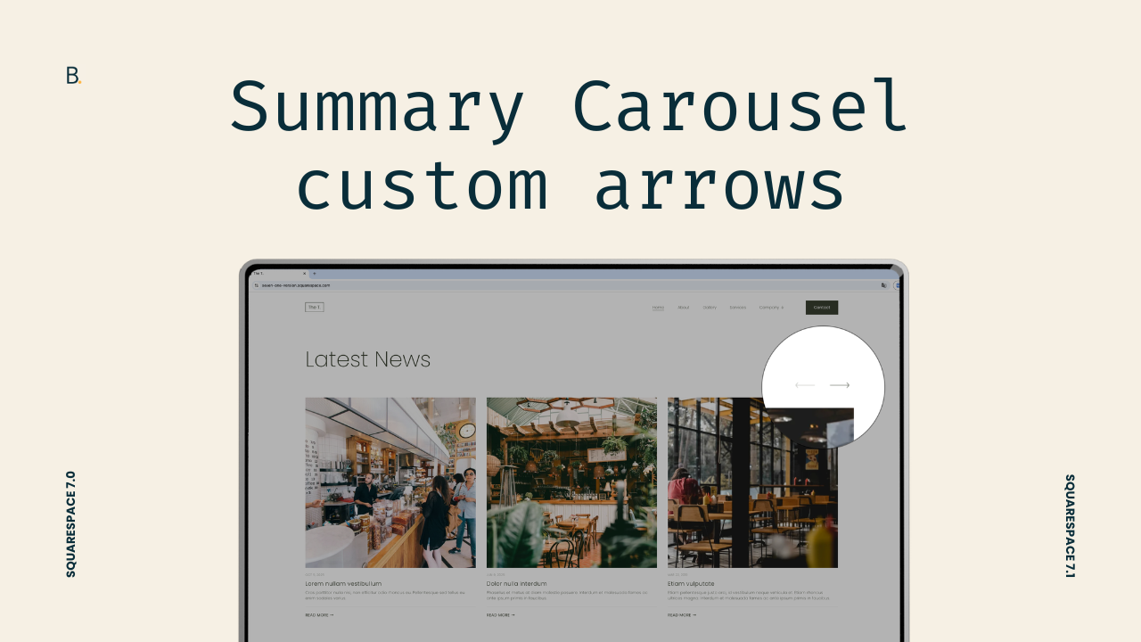
You know ‘em, you love ‘em, but you’re probably not that fond of their arrows.
Summary Block Carousels are great to use on client projects… but their default navigation arrows don’t always match the visual direction of the design.
In this tutorial, we’ll walk through how to replace the default chevron Summary Carousel arrows for custom image-based ones, using only a small amount of CSS (I used ones from Reshot in case you liked them).
Along the way, I’ll also show you some helpful tips to keep in mind when you’re facing a style-replacement situation vs. simply adding a new thing the element doesn’t have.
Note: if you want to move the arrows – styled or not – below the content or to the sides of the carousel, you can check out this plugin and this other one.
Let’s go!
Video timestamps
00:00 - Intro & customization overview
This customization will only require some CSS and your pre-uploaded custom arrow files inside the Custom Files section of the site. So once you have those in place, you’ll be able to follow along.
01:00 - Inspecting the default carousel arrows
We’ll begin looking through the Inspector Tool to check out how Squarespace builds its carousel arrows natively. Based on what we find, we’ll decide which method to use to substitute the original icons. Spoiler: if you’re planning on replacing the chevrons with a different unicode character, you’ll pretty much be set just with this step!
03:00 - Choosing the replacement strategy
Now that we know what’s what, we’ll decide where we want to set up our background image (since we'll have more than one container to choose from) and how to hide the existing arrow.
05:45 - Implementing the custom arrow images
Next, it’s time to pick our selectors. Since we’ll be adding the image to a container that doesn’t currently have a background-image property, we’ll be able to use any class we want in our code. However, we’ll see that when it comes to hiding the original icon, taking a similar “simple” route won’t be enough. I’ll walk you through the difference and what to do in those situations. You’ll be able to apply the same logic anywhere else when customizing projects!
08:40 - Fixing the size & final result
Finally, with our two new arrows in place, we’ll address the sizing issue caused by the parent controls container, override the fixed width, and manually set dimensions so the custom arrows display correctly. Once that’s done, you’ll have your custom carousel ready to go!
TL;DR
You’ll need to upload two image files inside your Custom Files area to replace the native carousel arrows.
To target the original ones, we’ll look at the structure and discover that they were created as ::before pseudo-elements.
In order to substitute them, we’ll pick a container on which to add our images as backgrounds, and hide the existing pseudo-elements carrying the native chevrons.
After that, it’s a matter of fixing the sizing issue that comes up after removing the original arrows and we’re good to go.
Not bad, right?
You can continue tweaking the span container we used and add a background color, a border, or just mark the modification as done and go about your day!
In any case, I hope you found this helpful.
Until next time,
B.
Full code
Custom CSS Window
/*CUSTOM ARROWS FOR SUMMARY BLOCK CAROUSEL*/
//Previous arrow
.summary-carousel-pager-prev {
  background-image: url(LEFT.png);
  background-position: center;
  background-repeat: no-repeat;
  background-size: contain;
  height: 50px;
  width: 50px;
}
.sqs-gallery-design-carousel .sqs-gallery-controls .previous:before {
  display: none;
}

//Next arrow
.summary-carousel-pager-next {
  background-image: url(RIGHT.png);
  background-position: center;
  background-repeat: no-repeat;
  background-size: contain;
  height: 50px;
  width: 50px;
}
.sqs-gallery-design-carousel .sqs-gallery-controls .next:before {
  display: none;
}

//Controls container
.sqs-block-summary-v2 .summary-block-setting-design-carousel .summary-carousel-pager {
  width: auto;
}