
Create a custom global animation in Squarespace 7.1
Can you add a custom animation to all blocks in Squarespace at the same time?
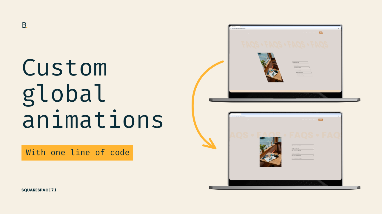
This tutorial demonstrates how to create custom global animations in Squarespace 7.1 by modifying the initial state of Squarespace's native animation system. Starting with the built-in Slide animation, the process involves identifying the animation classes applied by Squarespace, examining the CSS properties that define the element's starting position, and then modifying those properties to introduce additional transform effects such as skewing and rotation. Because Squarespace's final animation state automatically overrides the custom transforms during playback, developers can create entirely new animation styles while still leveraging the platform's existing animation framework. The result is a flexible technique for building unique site-wide animations with only a small CSS modification.
Feeling kinda “meh” about the native global animation options in Squarespace?
Wish you could build out your own, without having to use the individual block options?
How about a compromise then?
One that requires modifying a single line of code.
Curious to see how this works? Then let’s jump right into it!
Video timestamps
00:00 - Introduction
So let me show you how you can create your own custom global animation in Squarespace 7.1 by modifying one line of code.
To do this, you only need to have one of the global animations already set on the site. I would highly recommend working with either Fade, Slide, or Scale, and avoid using Clip or Flex because those last two are a little bit finicky to work with.
Then, to build our own animation, we need to take three steps. First, we need to find the class that Squarespace is using to set the initial state of the animation. Second, we need to look at what that initial state is actually doing. And third, we need to adapt the code so that it works with the effect that we are trying to achieve.
So let's go ahead and get started.
00:42 - Finding the Animation Classes
I'm already working with the Slide animation, and I'm going to be inspecting one of the elements that I have already seen that moves on page load.
So let's go ahead and inspect this text element here.
And like I said, we're going to look for the classes that Squarespace uses to apply these animations in the first place. Now luckily for us, the way that Squarespace labels those classes is pretty straightforward, so they're kind of easy to find. You just need to look through different containers for that same element to see where those classes are actually being applied.
So let's go ahead and take a look here.
So here I'm standing on the h1, and I can see that there are two classes present. We have .preSlide and .slideIn, which are the classes that Squarespace uses for the Slide animation to be able to set both the initial and the final state.
01:30 - Understanding the Initial State
Now, the one that we care about is the initial state because that's the one that determines what the element is going to look like before the animation starts, so that we can see that transition from that initial point into the final one.
So once we have that located, it's just a matter of looking through the right side to see what that initial state was like.
So here you can see that we have that .preSlide class, and you can actually see all the elements that are being affected by it. And then we have the initial state had an opacity of zero, a transform of translate(0, 30%), and then we have the transition property that just affects the transform and the opacity.
Now, of course, at the moment these two things are being crossed off because then up here we have a couple of things that are overriding that state. So the .slideIn animation, which is the final state, is setting that transform to translate(0, 0). And then here we have another part of the code where the .slideIn class is also being targeted, and then this one is modifying that opacity of 0, bringing it all the way up to opacity of 1.
Once more, what we're going to focus on is this .preSlide class.
02:31 - Creating a Custom Animation
Now, depending on what it is that you want to do, you may need to modify this snippet differently than the way that I'm going to do it.
So what I'm going to be doing is modifying this transform property because, apart from this translate that this property already carries, I want to also modify the rotation and the skew of the elements, which is going to give an effect that is very different from the one that we currently have.
So, the way that I'm going to modify this is by first targeting the class, of course. So let's go ahead and target .preSlide.
And because I want to affect all elements that have that class inside my site, I'm not going to be narrowing things down. You could absolutely set this up so that it only affects a specific section or a specific block, but I'm not gonna cover that right now because I want to keep things simple.
03:20 - Keeping the Existing Slide Effect
So let's go ahead and go back and grab the value that this transform property is having.
And the reason why I'm going to be using this in here is because if I don't, if I start adding other things inside the transform property, that translate is going to be overwritten. So I'm not going to have that slide happening at the same time as my own additions.
So I'm gonna keep that in there, and then we are going to play around with the skew function.
So let's set this one to something kind of obvious. So let's make it like 30deg. And then I also want to rotate this just for fun. Let's go ahead and set this up as, I don't know, 45deg. Alright.
04:04 - Testing the New Effect
So now what this means is that the initial state of the element is going to be a little bit further down, so 30% further down from where it should be. That is going to be skewed 30 degrees, and it's also going to be rotated 45 degrees.
So it's gonna look kind of wonky at the beginning, and then you're gonna see all of that going back into place because the final state of .slideIn, or that class of .slideIn that determines the final state of the animation, is making the transform change to translate(0, 0). And this is set as !important, so whatever it is that I add inside my transform property is going to be automatically overwritten by the .slideIn class.
So let's go ahead and save the changes because otherwise it's not gonna take effect. And then if I refresh this here, you're going to see that now that looks kind of weird.
And then if I start scrolling down, you can see how the same .preSlide animation does the exact same thing for all of the elements that are meant to be animated, which again, this is kind of a weird look, but you get the point, right?
05:14 - Tweaking the Animation
So with this, we can go ahead and just modify things however we want.
Now, I'm not sure if I like that level of skewness, so if I don't know if that's a word, but I don't know if I like that level there. So let's go ahead and keep it as 20deg.
And then for rotation, I actually don't want the whole element to rotate like in a circle. I just want it to rotate in one of the axis. So I'm going to set this to rotateY().
And then once I have that, let's refresh the page.
And then here we're going to see, oh, that looks a lot better, doesn't it?
So here, you can see how that is sort of like starting skewed and also kind of rotated on the y axis, so vertically, and then it's also sliding up. So we have the combination of all of those things coming up when we're scrolling down the page.
And that just creates an animation that is very different from the existing global ones.
TL;DR
To make this work, enable one of the existing global animation options. If you want to use the code from this tutorial, go for the “Slide” one.
Target the corresponding “initial state” class of the animation, which is .preSlide in this case.
Include any of the existing styling properties that you want to modify, or copy them as is if you need to ensure that the initial effect still applies.
Adapt the values to your liking and have fun!
Hope you liked this trick!
Until next time,
B.
Full code
Custom CSS Window
/*CUSTOM GLOBAL ANIMATIONS IN SQUARESPACE 7.1*/
.preSlide {
  transform: translate(0,30%) skew(20deg) rotateY(45deg);
}