
Easy blurry animation for hero sections in Squarespace 7.1
Animation for background images in Squarespace
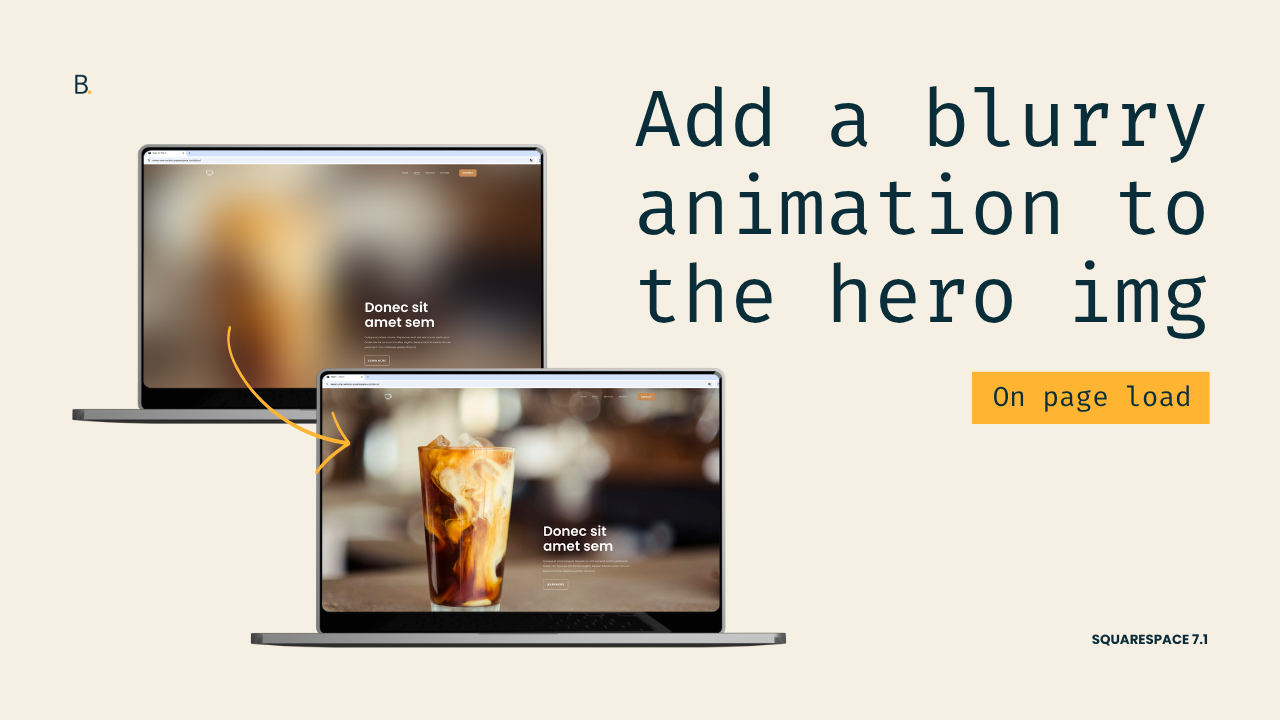
This tutorial demonstrates how to create a blur-to-focus hero image animation in Squarespace 7.1 using only CSS. The process involves defining an initial state where the hero background image is heavily blurred and slightly enlarged, creating a keyframe animation that restores the image to its normal size and clarity, and then applying the animation with custom timing and delay settings. By targeting the hero section through an anchor link and narrowing the selector to the background image container, the effect remains isolated to the intended section. The result is a professional page-load animation where the image gradually sharpens and zooms into place, creating a polished and engaging visual experience.
How about we tackle a simple yet fun animation for Squarespace background images on load?
At least, for the one at the top of the page.
I’ll walk you through how to set up a blurry/zoom effect, but the same method and logic can be used as a mere starting point to create something as bold or as minimal as you want.
You can build something truly unique for your client, just by swapping some properties and getting creative.
So, one way or another, I hope you feel inspired by this one!
Video timestamps
00:00 - Quick Overview
Alright so, let me show you how you can create this blurry hero entry effect in Squarespace 7.1.
All you need for this is a hero section with a background image and some CSS.
We're gonna be tackling this in three steps. First, we're going to create the initial state, the blurry state that this image is going to have right after page load. Second, we're going to create the final state that we want the image to go to, which is going to be the fully focused state. And third, we're going to create (*link) the animation that is going to transition between the initial state and the final one.
00:31 - Narrowing Down the Selector
Now considering the fact that this animation is going to be triggered on page load, we're going to be modifying just the hero section of this page.
So I already gave this one an Anchor Link of #blur-hero, which is what I'm gonna be using in my code.
And to make sure that I'm only going to be modifying the image in the background and no other image that I may add into the section in the future, I'm going to be narrowing down my code a little bit more to make sure that I'm targeting the image within the .section-border container inside this #blur-hero section.
So let's go ahead and set up our selector here based on those requirements.
So #blur-hero .section-border img.
So again, now just the image inside the .section-border container within this hero area is going to get modified.
01:25 - Creating the Initial Blurry State
So let's see what this image is going to look like right after the site loads.
So I'm going to be using here the filter property, and I'm going to set this to blur(100px).
I'm also going to be including in here the transform property and setting this one to scale().
So I want the image to be a little bit bigger on page load so that it sort of zooms out and then focuses at the same time, creating that look that you already saw.
So with this initial state already set up, let's go ahead and move on to the final state.
01:57 - Creating the Final Focused State
So the final state is something that we're going to be building within the actual animation itself.
So let's go ahead and give this @keyframes animation a name. I'm going to call this one focus.
And then the only step that this animation is going to have is the final one, which we can address either through the to keyword or through 100%.
So what we want is for this to become unblurred, so I'm going to set the filter to none.
And then we want the size to go back to normal, so we're going to set the transform to none as well, or we could also use scale(1), whichever.
So now that we have the final state here and the initial state in here, it's a matter of connecting the two things.
02:42 - Connecting the States with Animation
So for that, we're going to go back into the initial state and we're going to add in our animation.
So here we need to first call out the animation that we want to use, which in our case, or in my case, it's called focus.
And then we need to set up how much time it's going to take for the image to become unblurred.
So I think I'm gonna keep this one fairly short. Let's use .5s.
And then because we want the final state to stick, we're going to be using here the keyword of forwards so that it goes from that initial state onto the final state and stays there. It doesn't go back into the blurriness.
And last but not least here, we can determine how long after page load we want this animation to be triggered.
So let's set a delay of maybe something like 1s so that we can see the blurriness and then see how everything is coming into focus and zooming out.
03:35 - Final Result
And then once we have that there, let's go ahead and try it out inside this Guest Mode.
So now if I refresh the page, you can see that we have that blurry mode for about one second, and then everything just goes into full focus. The image zooms out, and then we have the image completely unblurred.
TL;DR
You’ll just need a regular background image and, optionally, an Anchor Link to target the section more easily.
First, you’ll need to set up the initial blurry state and zoom level you want the image to have right after page load.
Then, you’ll need to create a @keyframes animation with the changes necessary to achieve the final state, the unblurred one.
And lastly, you’ll need to link the animation with the initial state of the element, giving it the timing and delay of your choosing so that it runs after the site loads.
Hope you enjoyed this one!
Until next time,
B.
Full code
Custom CSS Window
/*EASY BLURRY ANIMATION FOR HERO SECTIONS IN SQUARESPACE 7.1*/
#blur-hero .section-border img {
  animation: focus .5s forwards 1s;
  filter: blur(100px);
  transform: scale(1.3);
}

@keyframes focus {
  to {
    filter: none;
    transform: none;
  }
}