
Minimal testimonial carousel using an Auto Layout in Squarespace (7.1)

We’re back with another 7.1 Auto Layout customization today!
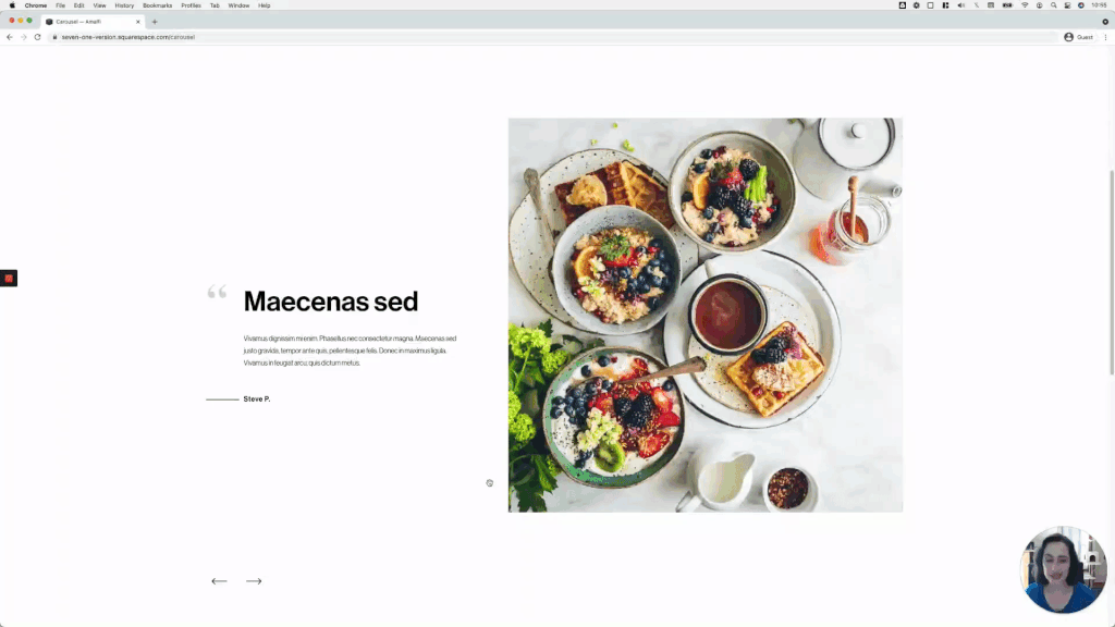
Last time we played around with the Slideshow Auto Layout, but this time we’ll be tackling how to create a lovely testimonial carousel using the Carousel version.
I personally love the final result of this one and the little details that make it stand out even more.
If you want to know how to make it happen, jump right into the tutorial!
Tutorial
Overview & timestamps
Thanks to the default structure and styles of this section, the customization will be fairly easy to achieve!
In fact, the most time-consuming part will be adding the details, not setting the base design:
00:35 - Auto Layout settings
To make the best of the native options for our carousel, we’ll begin by looking at all the different settings I’ll be using. This way, if you want to achieve the exact same result, you’ll be able to replicate it!
03:35 - Setting the slide content side-by-side
Moving onto the CSS, we’ll begin by setting up the slide layout side-by-side vs stacked with only one property.
06:49 - Vertically centering the content
Next, we’ll make sure that everything is aligned through the middle, so that the content looks vertically centered next to its image.
07:41 - Styling button as client name
To make sure the client name sits and behaves the way we want it to, we’ll get rid of the extra spacing around it, and make sure it isn’t clickable anymore.
11:00 - Adding corner image
As for the little corner quote, we’ll use a background image to set things up within our testimonial container, to keep things simple.
14:25 - Setting up the line
Next, we’ll create the line that accompanies the client name, and offset the whole thing to make sure the beginning of the name aligns with the left side of the testimonial text.
17:46 - Checking mobile and making adjustments
Last but not least, we’ll check out the mobile result and make two small tweaks to make sure that the line doesn’t cause any issues, and that everything stacks nicely on smaller screens.
Until next time,
B.
Full code
Side-by-side Auto Layout customization
Custom CSS Window
/*MINIMAL TESTIMONIAL CAROUSEL WITH AUTO LAYOUTS (7.1)*/
.user-items-list-carousel__slide {
  align-items: center;
  flex-direction: row-reverse;
  overflow: hidden;
}

.user-items-list-carousel__media-container {
    flex: 0 0 50%;
}

.user-items-list-carousel__slide .list-item-content__button {
  padding: 0;
  pointer-events: none;
}

.user-items-list-carousel__slide .list-item-content {
  background-image: url(YOUR-IMAGE-GOES-HERE.PNG);
  background-repeat: no-repeat;
  background-size: 50px;
}

.user-items-list-carousel__slide .list-item-content__button::before {
  background-color: black;
  content: '';
  height: 2px;
  display: inline-block;
  margin-left: -90px;
  margin-right: 10px;
  vertical-align: middle;
  width: 80px;
}

@media screen and (max-width: 767px) {
  .user-items-list-carousel__slide {
    flex-direction: column;
  }
}

@media screen and (min-width: 767px) {
  .user-items-list-carousel__media-container {
    margin-bottom: 0 !important;
  }
}
(Optional) Arrow alignment fix when working with the “centered” option
Custom CSS Window
/*ARROW CENTER-ALIGNMENT FIX FOR AUTO LAYOUT CAROUSELS (7.1)*/
.user-items-list-carousel__arrow-positioner {
  padding-bottom: 0 !important;
  position: absolute !important;
  top: 50%;
  transform: translateY(-50%);
}

//To adjust the side offsets for the arrows
.user-items-list-carousel__arrow-wrapper--right .user-items-list-carousel__arrow-positioner {
  right: 20px;
}
.user-items-list-carousel__arrow-wrapper--left .user-items-list-carousel__arrow-positioner {
  left: 20px;
}