
Creating a bold side-by-side slideshow in Squarespace, using auto layouts (7.1)

I don’t know about you, but I’m really liking Squarespace’s Auto Layouts.
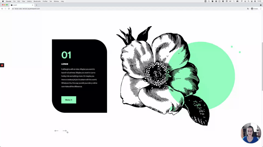
Personally, I think they’re pretty versatile, and I love how we don’t have to rely on the Gallery Sections anymore to create slideshows and carousels. Sometimes it’s necessary to have more room to add text, don’t you think?
Anyway, I’ve been playing with these layouts lately and came up with a really cool and bold way to display content using the Slideshow option.
And today, I want to share that customization with you!
I feel this would be great for testimonials or steps of a process, but it’s up totally up to you how you use it!
So, without further ado, let’s get to it:
Tutorial
Overview & timestamps
The customization may look a bit daunting at the beginning, but I promise you you’ll be able to pull it off (and wow your client!) by following along:
00:22 - Setting up the slideshow Auto Layout
First, I’ll walk you through the settings I’m using for my slideshow, so you can replicate the exact look if you want to!
03:06 - Setting the slide content side-by-side
Next, we’ll dive deep into the customization, starting with setting the image and content side-by-side, instead of having one overlap the other.
06:43 - Inverting the content placement
Once we have that in place, we’ll be able to easily decide what should be on which side of the slide, by changing a single value!
07:50 - Fixing cropped images
We’ll run into a little issue regarding the image size, but we’ll fix it with a simple CSS property.
10:35 - Adding spacing inside the slides
Next, we’ll take care of the distance between the slide elements, to give everything a bit more of a breathing room.
11:24 - Adding a rounded border to specific corners
To finish up the desktop look, we’ll create a slightly rounded design for the content area, by targeting only two of its corners.
13:44 - Stacking slide content on mobile
Moving onto mobile devices, we’ll first set up a media query to decide when to stack the slide content, AND whether to have the image on top of the text or not.
15:17 - Fixing an overflow issue
Another issue will come up here, based on something we did on desktop, so we’ll need to fix it before finalizing our design.
17:01 - Adding spacing on mobile
And then, last but not least, we’ll add some distance between our stacked elements, to end up with a lovely, super responsive, side-by-side slideshow!
I hope you find this helpful for your next project!
Until next time,
B.
Full code
Custom CSS Window
/*BOLD SIDE-BY-SIDE SLIDESHOW WITH AUTO LAYOUTS (7.1)*/
.user-items-list-banner-slideshow .slide-media-container {
  margin-left: 90px;
  position: relative;
}
.user-items-list-banner-slideshow .slide {
  flex-direction: row-reverse;
}
.user-items-list-banner-slideshow .list-slideshow-image {
  object-fit: contain !important;
}
.user-items-list-banner-slideshow .slide-content {
  border-top-right-radius: 5vw;
  border-bottom-left-radius: 5vw;
}

@media screen and (max-width: 767px) {
  .user-items-list-banner-slideshow .slide {
    flex-direction: column-reverse;
  }
  .user-items-list-banner-slideshow .slide-media-container {
    margin-left: 0;
  }
  .user-items-list-banner-slideshow .slide-content {
    margin-bottom: 88px;
  }
}