
Bring up the Auto Layout Carousel mobile arrows on tablets
How to show mobile arrows on tablets for Auto Layout Carousels in Squarespace 7.1
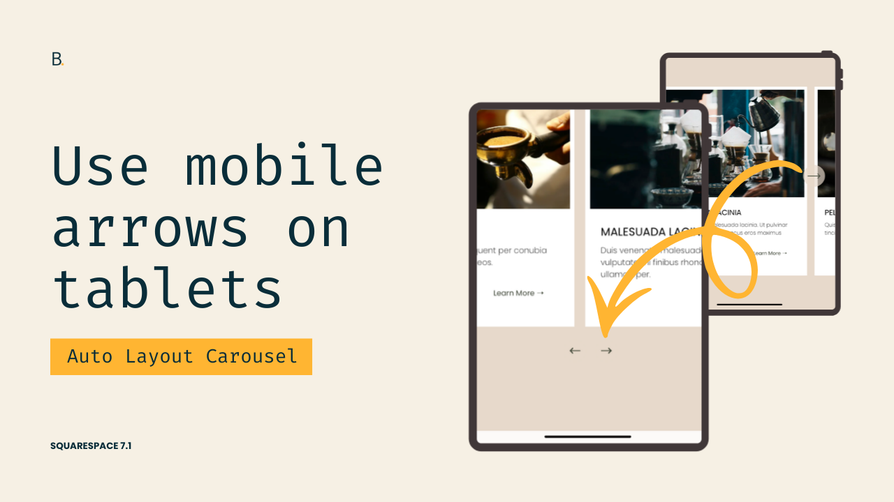
This tutorial shows how to bring mobile-style bottom arrows into tablet and desktop views for Auto Layout Carousels in Squarespace 7.1. The approach involves hiding the default desktop arrows, revealing the mobile arrows, and wrapping both changes inside a custom media query so they appear at your chosen screen size. By targeting the correct carousel classes, you ensure the changes only affect Auto Layout Carousels and not other elements on your site. Adjusting the display property to flex preserves the intended mobile layout, while the breakpoint can be customized depending on when you want the switch to happen.
Not happy with the side arrows look of Auto Layout Carousels on tablets?
Wish there was a way to display them below the content without affecting the desktop look?
I gotchu.
In this tutorial, we’re going to tweak the native look and bring up the mobile arrows whenever we like, in 3 simple steps: we’ll hide the desktop arrows, showcase the mobile ones, and use a media query to control exactly when that switch takes place.
Let’s make it happen!
Video timestamps
00:00 — The 3 steps to the Arrow Swap
Let me show you how you can quickly bring up the mobile arrows, on tablets, in Auto Layout Carousels in Squarespace 7.1, so that you can go from these arrows here on the side to these ones at the bottom.
In order to achieve this, we basically need to do only three things: we need to hide the desktop arrows, we need to display the mobile arrows, and then we need to wrap everything inside a media query of our choice.
So without further ado, let's go ahead and get started.
00:24 — Locating and Hiding the Desktop Arrows
I already have my Auto Layout here with the side arrows enabled within the section. So like I mentioned, the first thing we need to do is hide the desktop arrows.
To be able to hide them, we need to know what they are called first so that we can hide that entire element.
So I pretty much landed on one of the elements that is just creating the left side arrow. Now if I keep looking up, I pretty much want to find where the end of this element is, or actually where the beginning of this element is, because I want to get rid of the whole thing, not just the arrow and not just the background.
We can see that there are a bunch of elements, and actually these ones for the desktop arrows are a little bit confusing because they stretch out way more than the button itself.
So if we go all the way up here, you're going to notice that we have this really big container that just says .desktop-arrows, and then .user-items-list-carousel__arrow-wrapper, and then .user-items-list-carousel__arrow-wrapper--left.
So this whole container is holding that left side button, and then down here we have another really big container that is holding the right side button.
So considering the fact that these two share that class of .desktop-arrows, that is the one that I'm going to be targeting via CSS so I can hide these two big elements.
Let's go ahead and set that up really quickly. So .desktop-arrows, and we're going to go ahead and set this to display: none.
So once I do that, you can see how the arrows disappear from screen.
02:00 — Narrowing things down to Auto Layout Carousels
Now one thing we need to note is that the .desktop-arrows class is pretty generic. It's not really telling us that this has to do with the Auto Layout Carousel or with the specific section or anything like that.
So if we were to use this class as is, we run the risk of editing or modifying something else that we don't want to touch.
So in order to avoid that, and considering the fact that I want to make sure that this customization applies to any other Auto Layout Carousel that I have on the page, I'm going to go back into my Inspect Element tool, and then I'm going to look for a class that represents that Auto Layout Carousel layout.
So looking all the way up here, this one contains somewhere inside it those desktop arrows. So this is the class that I'm going to be using, .user-items-list-carousel.
Let's add that one in here, .user-items-list-carousel, and now we can be sure that only the Auto Layout Carousels are going to get those desktop arrows modified.
03:02 — Finding and Displaying the Mobile Arrows
So now the next step would be to show the mobile arrows, and now in order to be able to show them, we need to be able to target them via CSS.
So the easiest way to find them inside the structure is to basically inspect them through the mobile view, because that's where we can see the element on the screen, so it's just easier to access.
So let's go ahead and inspect those elements and see what we find.
Alright, so I landed again on the SVG that is creating that arrow path, and then if we start looking upwards, we can see that that one is sitting within this button element that has a class of .mobile-arrow-button--right, so this one is the right side button, and then we have another one up here that is for the left side button.
And we can see that both of them are sitting within this container called .mobile-arrows.
So if we were to target that .mobile-arrows container and then set it to display: block, we're going to be able to show the arrows whenever we want.
04:03 — Why using display: block isn’t ideal
So let's go ahead and get started by setting this up. I'm going to be using that class of .mobile-arrows, and then since we mentioned that we wanted to make sure that only Auto Layout Carousel arrows get modified, I'm also going to be including this class of .user-items-list-carousel in the selector.
But basically here, what we can do is just set the display value.
Now in this case, we can't quite use display: block, and let me show you why. If we were to set this to display: block, you can see how the arrows do show up here on the side, however they don't really carry the same layout that they have on mobile.
And that is because on mobile, they're using a different value for display.
If we take a quick look at that .mobile-arrows container, we're going to see that inside a media query that Squarespace uses to display them on smaller screens, at 575px and lower, we have the display value set to flex instead of block.
So because we want to mimic that same look, we're going to change our display value to flex as well.
05:46 — Setting up the breakpoint
And now the third and final step here is to wrap all of this inside a media query.
So here is where we're going to determine when we want these two changes to happen. So I think I'm going to be using here a media screen and max-width breakpoint of 960px.
You can go ahead and adjust that to your liking.
Now you know that the breakpoint that Squarespace uses for the mobile arrows is 575px, so if you want to use that as a reference, you can go ahead and do that. You can just use something bigger than that number so that you can show them sooner, but it doesn't have to be 960 pixels.
06:32 — Final Result
And now once I have that there, I can go ahead and refresh this.
But here you can note that we now have the arrows showing up, and you can see that at 960 pixels we get those mobile arrows showing up, and of course they're going to be remaining in place until we hit really, really thin screens.
TL;DR
Squarespace uses different elements for desktop and mobile carousel arrows.
Desktop arrows live inside a container called .desktop-arrows, while mobile ones are inside a .mobile-arrows container.
To swap them, first you need to hide the desktop arrows with display: none.
Then, to show the mobile arrows properly, you can use display: flex (instead of block).
Lastly, you’ll need to wrap everything inside a media query to control when the switch happens.
Hope this helped!
Until next time,
B.
Full code
Custom CSS Window
/*BRING UP AUTO LAYOUT CAROUSEL MOBILE ARROWS ON TABLETS*/
@media screen and (max-width: 960px) {
  .user-items-list-carousel .desktop-arrows {
    display: none;
  }
  .user-items-list-carousel .mobile-arrows {
    display: flex;
  }
}