
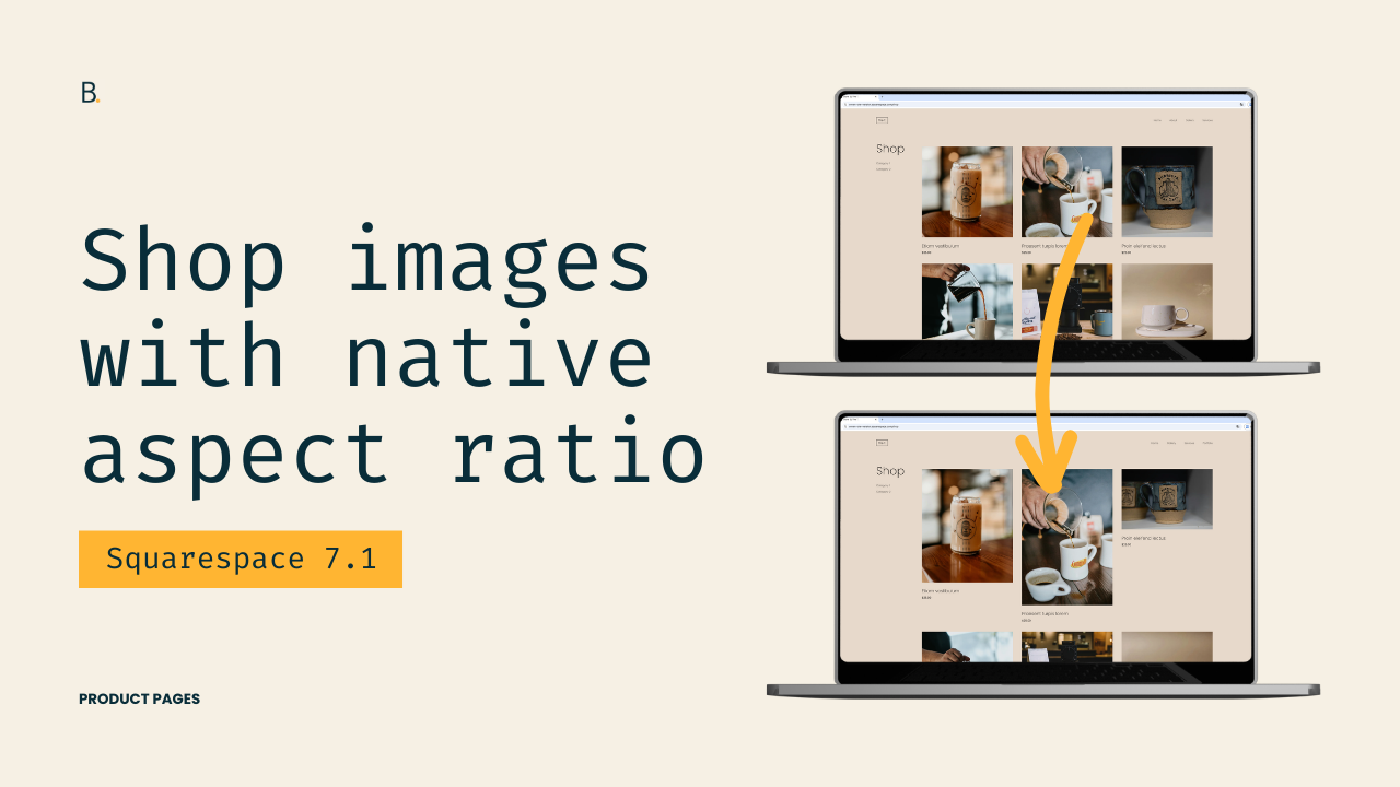
Multiple aspect ratios for Product page images in Squarespace 7.1
How to keep the original aspect ratio of Product or Shop images in Squarespace 7.1?
This tutorial shows how to make Squarespace 7.1 Product pages display images with multiple aspect ratios, perfect for photography, art, and visually-focused catalogs. Since Squarespace doesn’t offer this natively, we override the default crop using CSS. The process involves:
- Inspecting the layout – identifying that the image is absolutely positioned and inherits its size from a parent container.
- Understanding the aspect-ratio variable – the container’s aspect-ratio property determines the crop based on the Product page settings.
- Overriding the aspect ratio – using the same selector in the Custom CSS window, we can set a fixed ratio or remove cropping entirely.
- Removing the crop – setting aspect-ratio: auto lets images display their natural dimensions.
- Fixing disappearing images – changing the image’s position from absolute to relative ensures correct sizing.
- Handling live site overrides – using !important guarantees that Squarespace’s default CSS doesn’t overwrite our changes.
The reason is irrelevant, you just want the flexibility of keeping the original aspect ratio of your client’s Shop page images.
I get it.
By default – and at least for the time being – we only have the option to crop all Product previews the same way in Squarespace. But, today, we’ll be looking at how we can remove that limitation using CSS, allowing each image to display at its native aspect ratio.
This a quick tweak so let’s jump into it!
Video timestamps
00:25 – Layout requirements
For this tutorial, I’m working with Squarespace 7.1 and using a Product page set to the Grid layout. You can pause the video to review my exact design settings if you’d like to replicate the same look, but none of those options are required for this customization to work.
As long as your Product page is using the Grid layout, you’ll be able to follow along without issues!
00:44 – Digging into what’s forcing the image crop
Before we can remove the crop, we need to understand WHAT’S causing it in the first place. The image crop could be enforced using the aspect-ratio property, a padding-based method, or something else entirely.
By inspecting one of the product images, we can see that the image itself is absolutely positioned and set to a width and a height of 100%. This tells us that the image isn’t defining its own dimensions. Instead, it’s inheriting them from a parent container.
01:24 – Finding the culprit for the current image crop
Looking at the parent container, we can clearly see an aspect-ratio property being set using a CSS variable. That variable corresponds directly to the option chosen in the Product page settings.
In my case, the value is 1 / 1 because I chose to work with a square crop, but depending on your settings, this value could be different. Changing this value manually (for example to 3 / 4) immediately updates how the images are cropped, confirming that this is the property we need to override. Perfect!
02:05 – Targeting the corresponding container
Since what we’re trying to do is modify an existing value rather than add something new, the easiest approach is to reuse the same selector that Squarespace already uses for this property.
By copying that selector into the Custom CSS Window, we can safely override the aspect ratio without much friction. Testing this by setting the aspect ratio to 3 / 4 confirms that our override is working as expected, so we can now move onto using the value we’ll actually need.
02:42 – Removing the native aspect ratio entirely
At this point, we have two possible approaches: we can either alter the value of the variable that Squarespace is using to set the existing crop, or set a fixed aspect ratio of our choice under the aspect-ratio property.
In this tutorial, we’re going with the second option.
By setting aspect-ratio: auto, we can effectively remove the previous crop and allow images to size themselves naturally.
But of course, we run into an issue… the images just vanished into thin air.
03:15 – Why the images disappeared and how to fix it
The images went bye-bye because they’re still absolutely positioned.
They’re trying to take on the dimensions of its parent container, but now its parent container (after the aspect-ratio value modification) is trying to take on the dimensions of the image.
So, basically, both things are trying to get their size from the other and neither is being successful.
To fix this, we need to target the img element itself inside each .grid-image-wrapper and change its position to relative.
With that, we now get the images showing in full, with their original aspect ratio.
However… we can’t celebrate just yet.
04:52 – Fixing the live site override issue
On the Live site, the customization doesn’t apply right away. What a shocker.
The problem is that, even though we used the same selector as Squarespace, their CSS file is loading after the Custom CSS Window one, which means their original value is still taking priority.
To fix this, we have two options: make the selector more specific by including other classes or IDs, or forcing the value with !important.
Now, even tho the first route is best practice, I’ll take the not-so-great one for the sake of time.
By adding !important to the aspect-ratio: auto declaration, everything now works correctly on both the Editor AND the Live site!
TL;DR
Starting out with the Grid Product Layout option of the Shop page, the first thing to do is look up how the original aspect ratio is setup in order to remove it or override it.
Seeing that the aspect-ratio property on the .grid-image-wrapper container is what’s causing the crop, we’ll be targeting the same containers via CSS in order to replace the original value with auto.
Because the original images were set as position: absolute by Squarespace, the images will temporary disappear after our tweak. However, we’ll be able to quickly bring them back by now targeting those img elements and giving them a position value of relative.
Lastly, upon checking the Live site, we’ll run into the oh-so-common issue of the code only working on Edit mode. However, after implementing the !important rule on the auto value, we’ll be able to effectively override the original code even if it still loads after our own.
I know that there were quite a few things to unpack here – even when the tutorial was on the shorter side – but hopefully all the explanations help with future issues as well!
Now, if your goal was simply to allow product images to display naturally without the native forced cropping, you’re good to go!
However, if you’d also like to adjust the spacing and make the layout feel more masonry-like, make sure to stay tuned for next week’s Masonry-like shop page layout!
Until next time,
B.
Full code
Custom CSS Window
/*MULTIPLE ASPECT RATIOS FOR PRODUCT PAGE IMAGES IN SQUARESPACE 7.1*/
.product-list .product-list-item .product-list-item-link .product-list-item-image .grid-image-wrapper {
  aspect-ratio: auto !important;

  img {
    position: relative;
  }
}