
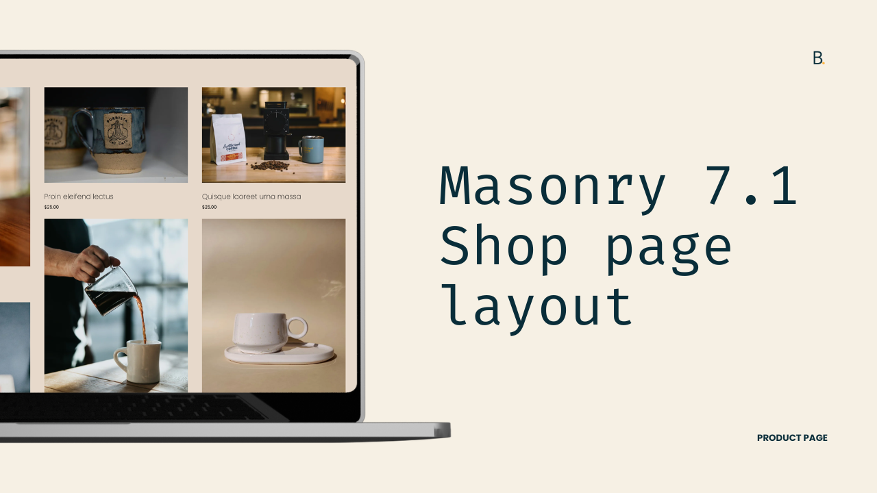
Quick Masonry layout for Product pages in Squarespace 7.1
How to create a Masonry layout for Product pages in Squarespace 7.1?
This tutorial demonstrates how to create a Masonry-style product layout in Squarespace 7.1 using CSS only. Instead of relying on true Masonry (which requires experimental CSS or JavaScript plugins), this approach uses the column-count property to create a vertical, newspaper-style flow. The process involves disabling Squarespace’s native grid layout, applying column-based layout rules, preventing product items from breaking across columns, and adjusting spacing manually. Media queries are used to control the number of columns on desktop, tablet, and mobile. Because this method relies on CSS columns, product order flows vertically rather than horizontally. This makes it best suited for projects where visual rhythm is more important than strict product ordering. For layouts that require precise ordering control, a JavaScript-based Masonry plugin may be a better solution.
Whether you’re displaying the original aspect ratio of Product images on your client’s site, or the title of some listings are natively much longer than the rest, if you want to condense the spacing of the grid items, a quick way to do it is with a Masonry layout.
Buuuut, since Squarespace doesn’t have that option at the moment, that’s exactly what we’ll be tackling today using code.
However, please keep in mind that this is a “quick” or rather limited Masonry approach… so it may not provide the level of control you’re after.
That being said, I still encourage you to give it a shot and see how it works for your project.
Let’s go!
Video timestamps
00:14 - Why this isn’t “true” Masonry
We are NOT implementing real Masonry like the one used in other areas of Squarespace.
Real Masonry with pure CSS is currently experimental in browsers, so it’s not quite usable on real-life projects. And real Masonry with JavaScript requires a third-party plugin like Isotope to build the layout.
What I’ll be doing in this tutorial is showing you how to use a simpler, quicker, CSS approach that looks like a Masonry layout, but doesn’t behave like one. Therefore, you can expect to encounter some limitations with this method.
01:33 - Altering Squarespace’s native product grid layout
I’ll be working with Squarespace 7.1, with my Product page set to the Grid layout. You can find this setting inside the Design tab, where the Product Layout is set to Grid. I’m also starting from the final result of the multiple aspect ratio tutorial, though it’s not required to implement this customization.
To achieve the fake Masonry layout, we’ll be using a CSS property called column-count, but before applying it, the first thing we need to do is identify what’s creating the existing grid layout so we can disable or override it.
If we inspect the area where all of the product items live, we’ll find a container called .product-list-layout-container. Inside it are all the individual product list items on the page, and if we look at this container more closely, we can see that it’s using display: grid.
If we temporarily disable that property, the grid disappears and all items stack vertically. So, this confirms that this container is what we need to modify.
03:23 - Using column-count to build a fake Masonry layout
In order to use the column-count property, the layout must be set to display: block instead of grid. Since we’re overriding a value that already exists in Squarespace, the easiest approach is to reuse the exact same selector that Squarespace uses.
I’ll grab the selector and paste it into the Custom CSS Window, then set it to display: block. Removing the grid stacks the items vertically, which is exactly what we want before setting the new columns.
Next, we can introduce the column-count property. This allows us to define how many columns the container should have. Since I was previously working with a three-column grid, I’m going to keep that same structure and set the column count to three.
At this point, we now have a Masonry-style layout, where items flow vertically instead of horizontally, similar to newspaper content.
04:19 - Preventing products from breaking across columns
You’ll probably notice that some product items appear split, with images separated from their titles or prices. This happens because the column layout can break elements across columns by default.
To fix this, we need to target the individual product items using their .product-list-item class and applying the break-inside: avoid property.
Once applied, both the images and their content stay together within each column. Awesome!
05:35 - Fixing vertical spacing between Masonry items
At this stage, you’ll notice that there’s spacing between columns, but not much spacing between rows. This happens because both display: grid and column-count rely on the column-gap property, which is already being controlled through the Design tab.
This is perfect, because it means we don’t need extra code to add column spacing. However, rows work differently. With grid layouts, rows exist. With fake Masonry layouts, they don’t.
Because of that, adjusting the row spacing through the Design tab settings won’t work. Instead, we need to add a bottom margin to each product item. Since we already have the items targeted, we can simply add a margin-bottom value. I’m going to use 30px, but you can adjust this based on your design.
07:11 - Making the layout responsive with media queries
Before jumping on the Live site, we’ll be handling mobile responsiveness. We need to decide at which breakpoints we want to change the number of columns created by column-count.
In my case, I’m going to use two breakpoints: one for tablets and one for mobile. I’ll create two media queries. For screens under 960px, I’ll set the column count to two. For screens under 640px, I’ll set the column count to one.
With this setup, the layout displays three columns on desktop, two columns on tablet, and one column on mobile.
08:44 - Troubleshooting the stubborn live site
After setting everything up, we’ll check out the Live site real quick because sometimes… you never know.
Aaaand of course, in this case, the layout doesn’t work as expected right away.
Inspecting the layout again shows us that the native Squarespace grid is still being applied and our display: block declaration is getting crossed off. What’s happening is that Squarespace’s CSS file is loading after ours, and because the selectors are identical, the original display: grid value is taking priority.
To fix the issue, we have two options: we can either make our selector more specific by adding additional classes or an ID, or we can force the value using !important.
For the sake of time, we’ll be using !important but, keep in mind, altering the selector is considered best practice.
In any case, once applied, the layout now works correctly across desktop, tablet, and mobile!
11:04 - Addressing the item order limitation and when the plugin route makes more sense
Last but not least, we have to talk about the order.
As mentioned earlier, the main limitation of this approach is that you won’t have control over the order of items. They will always flow vertically like newspaper columns.
So, if maintaining the order (as much as possible) is important for you or your client, a JavaScript-based Masonry plugin – like Isotope – may be a better solution for your project.
You can leave me a comment on the video if you’re interested in seeing a tutorial on how to use that plugin!
TL;DR
Masonry for product pages can be achieved through the column-count property.
The first step is to disable the native grid on the .product-list-layout-container element by using display: block.
Next, column-count needs to be brought in and set to the number of columns that you want to display on desktop.
To stop the product images from separating from their title and price, you’ll need to target each product item (.product-list-item) and give it a break-inside value of avoid
The spacing between columns can continue to be modified through the native column settings on the page. Whereas the row spacing has to be set for each product item with a bottom margin.
To create a responsive look, you can create as many media queries as you need to alter the column-count value for different breakpoints.
The code as is will only apply to the Editor mode but not the Live site. That is due to the selector specificity we have, and the fact that Squarespace’s code file is loading after ours. To fix it, we’ll use the !important rule to save time. But, altering the selector is considered best practice.
The column-count route has one major limitation: its item order cannot be controlled. The flow will always happen vertically instead of horizontally.
If you want to maintain the horizontal order of items as much as possible, then a third-party plugin like Isotope is required to build the Masonry layout. You can comment on the video if you want a tutorial on how to use it!
So, there you have it! A Masonry-ish layout with a few lines of CSS.
Feel free to try this method out on other areas of the site!
In any case, I hope you found it helpful!
Until next time,
B.
Full code
Custom CSS Window
/*QUICK MASONRY LAYOUT FOR PRODUCT PAGES IN SQUARESPACE 7.1*/
.product-list .product-list-layout-container[data-product-list-layout=grid] {
  column-count: 3;
  display: block !important;

  .product-list-item {
    break-inside: avoid;
    margin-bottom: 30px;
  }
}

//Tablet column number
@media screen and (max-width: 960px) {
  .product-list .product-list-layout-container[data-product-list-layout=grid] {
    column-count: 2;
  }
}

//Mobile column number
@media screen and (max-width: 640px) {
  .product-list .product-list-layout-container[data-product-list-layout=grid] {
    column-count: 1;
  }
}