
Show adjacent slides on mobile for 7.1 Auto Layout Carousels
How to display adjacent slides for Auto Layout Carousels in Squarespace 7.1 on mobile?
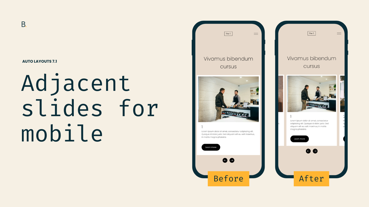
This tutorial shows how to recreate the desktop “peek-through” carousel effect on mobile in Squarespace 7.1. While Auto Layout Carousels can display adjacent slides on desktop using Show Adjacent Slides, Squarespace disables this behavior on mobile by default. We start by inspecting the carousel structure to understand how overflow is handled. On mobile, Squarespace applies a media query that sets the carousel container’s overflow to hidden, preventing neighboring slides from appearing. By reusing the same selector Squarespace applies on mobile and overriding it with overflow: visible, we restore the ability for slides to extend beyond the viewport. However, overflow alone isn’t enough — because the carousel container still spans the full width of the screen, there’s no space for adjacent slides to appear. To solve this, we reduce the container’s width using max-width and center it with auto margins. This creates visual breathing room on both sides, allowing adjacent slides to peek into view naturally on mobile. The tutorial also includes an optional variation for enabling adjacent slides only on mobile, even if they’re disabled on desktop, by targeting Squarespace’s data-show-adjacent-slides attribute.
This is a very very specific tweak for Auto Layout Carousels but… you know we like to cover those on this blog so, why not?
Today’s tutorial gets down to the nitty-gritty of why the slides aren’t showing up in the first place so, if you’re into learning about how code works, the video will provide a few helpful tips that you can use during your own “detective work” sessions, when working on client projects.
But if you’re not interested in that, feel free to grab the corresponding code at the end of the post and call it a day!
Either way, let’s jump into it.
Video timestamps
00:00 - What the Auto Layout Carousel looks like by default vs. the final result
To make sure we’re on the same page before getting started, when I’m talking about showcasing the side slides on mobile for AL Carousels, I’m referring to implementing the same look that Squarespace gives us when we enable the “Show Adjacent Slides” option inside the section’s settings.
By default, the slides hide on mobile. But, if you want to keep them peeking through the sides, the code from this tutorial will help you bring the layout to smaller screens.
00:41 - The Carousel options I'll be working with and which ones are required
There aren’t any requirements to this when it comes to the section’s native options, but do keep in mind that if you’re looking to display the adjacent slides ONLY on mobile, the code will need to be slightly modified in order to work.
I’ll show you how to do that by the end of the tutorial, but for now, let’s move onto the first general step of the process.
01:22 - Looking through the structure of the Carousel on desktop as a reference point
The first thing we need to do is look at how the carousel is built – at least the part that’s holding the slides – and how the current adjacent slides are being displayed on desktop.
That can help us have a reference point to know what to look for on mobile.
02:44 - Locating the initial culprit of the adjacent slides' visibility on desktop
After inspecting the “grid container” – the one holding all the list items inside the Auto Layout – we start getting clues about how things are set up.
Since the grid container doesn’t reach the edges of the website but the content inside it does, it’s very likely that an overflow property is playing a part somewhere in the structure. We just don’t know how or where unless we keep looking.
Luckily, after inspecting the container that directly holds our grid (the slides-revealer) we can very quickly spot the overflow property set to visible inside Squarespace’s CSS. And, if we decide to toggle its value between visible and hidden, we can confirm on the screen that that’s what’s currently allowing the side slides to display on desktop.
That’s a great start!
03:10 - Inspecting what happens to that same "revealer" container on mobile
With our reference point, looking at the same container through the mobile preview we can see that under a media query of up to 575px there’s a snippet applying an overflow value of hidden.
So, since we want to stop that cut-off and substitute the overflow value, we can take the easiest route and reuse the same selector that Squarespace is using, so that we can override its code.
04:11 - The nitty-gritty on why nothing seems to happen at first
But of course, nothing happens. Because why would it be that simple?
Inspecting the current CSS that’s applying to our “revealer” container, shows us that our code IS in fact working. The new value is applying, the original one is crossed off, yet we don’t see the slides… why?
That’s because the cut-off isn’t the only thing that’s stopping them from showing: they’re also positioned outside the visible area of the website.
We find this out by looking at the slides themselves and spotting the next one starting right at the edge of the right-side scrollbar, outside the viewport. So, we need to find a way to bring them in.
Considering the fact that Squarespace automatically calculates their position (on mobile at least) using the transform property, the best approach we have to make them show up is to allow more room for them to sit in by shrinking down the “grid” or “revealer” container.
In other words, it’s time to implement a max-width fix.
07:00 - Implementing a max-width modification on the "revealer" container
Since we’re already modifying one of the containers that controls the space where the middle slide shows up, we’ll apply the max-width adjusment to it too.
I’ll use 80%, but feel free to use the value of your choice (vw or % recommended).
Then, after a quick “screen tug”, we see how Squarespace recalculates the placement of the side slide, effectively letting us see it on screen.
07:55 - Choosing to keep the Carousel slides left or center-aligned
Now, with the critical part all set, we can choose whether we want to keep the default left-alignment that the max-width created, or evenly distribute the space to the sides of the middle slide by using margin: 0 auto
I want mine centered, so I’ll apply the margin fix in the code.
08:26 - Confirming that the previous overflow modification is in fact needed
Before moving forward, we’ll do a quick check of the previous declarations added to our code. Specifically, we’ll double-check that the overflow: visible IS in fact needed for the customization.
Doing this can help keep your code cleaner, since sometimes one fix can render a previous one unnecessary.
In this case, we can confirm that we do need both.
08:42 - Setting up a media query to display the adjacent slides on mobile
Next up, we need to ensure the customization only applies to mobile since the max-width limit is currently applying to desktop too.
Since Squarespace was hiding the overflow for screens under 575px, we can use that same breakpoint in our code. However, feel free to adjust it to whatever works best for your project if you have something else going on.
09:54 - Code modification to display the Auto Layout adjacent slides on mobile but NOT on desktop
Finally, last but not least, we’ll address what needs to change if you ONLY want the adjacent slides to display on mobile devices but NOT on desktop.
Basically, what needs to change is the selector.
The one we’ve been using all along contains the data-show-adjacent-slides attribute when it’s set to “true”. However, when the option is disabled inside the Auto Layout Carousel’s settings, the value changes to “false” in the HTML structure.
Therefore, we need to adjust it in our code as well to match the selectors and have the code working again.
TL;DR
No special settings are required to achieve the customization. However, having “Show Adjacent Slides” disabled on desktop will need a slightly different version of the code.
The desktop structure helps us understand how the side slides are being shown/hidden natively. This becomes our reference point to know what to look for on mobile.
By inspecting the same “slides revealer” container we saw on desktop, we can spot the overflow: hidden declaration that’s implemented by default on mobile screens.
Modifying that value via our Custom CSS Window – while reusing the same selector – doesn’t seem to help until we troubleshoot and notice that the following slides are sitting outside of the viewport area.
To bring them in and closer to the middle slide, we can reduce the space that the latter occupies by applying a max-width value on one of the containers that holds it.
This, combined with a margin: 0 auto;, effectively displays the previous and next slide while keeping an even space around the middle one.
To ensure we only modify the mobile version, we can wrap the code inside a media query. Using the same breakpoint as Squarespace does the trick for the tutorial, but you may want to use a different screen width for your project.
Last but not least, we’ll see that if we choose to disable the adjacent slides on desktop we also have to adapt the code to make it match the corresponding value that the structure carries. When the adjacent slides option is enabled, the attribute of data-show-adjacent-slides is set to true. If it’s disabled, the attribute shows as false in the HTML and – therefore – it’s reflected in the selector.
Phew.
This was a nerdy one, but I hope you found it helpful!
Until next time,
B.
Full code
If adjacent slides are enabled on desktop
Custom CSS Window
/*SHOW ADJACENT SLIDES ON MOBILE FOR 7.1 AUTO LAYOUT CAROUSELS*/
@media screen and (max-width: 575px) {
.user-items-list-carousel[data-show-adjacent-slides="true"] .user-items-list-carousel__slides-revealer {
  margin: 0 auto;
  max-width: 80%;
  overflow: visible;
  }
}
If adjacent slides are disabled on desktop
Custom CSS Window
/*SHOW ADJACENT SLIDES ON MOBILE FOR 7.1 AUTO LAYOUT CAROUSELS*/
@media screen and (max-width: 575px) {
.user-items-list-carousel[data-show-adjacent-slides="false"] .user-items-list-carousel__slides-revealer {
  margin: 0 auto;
  max-width: 80%;
  overflow: visible;
  }
}