
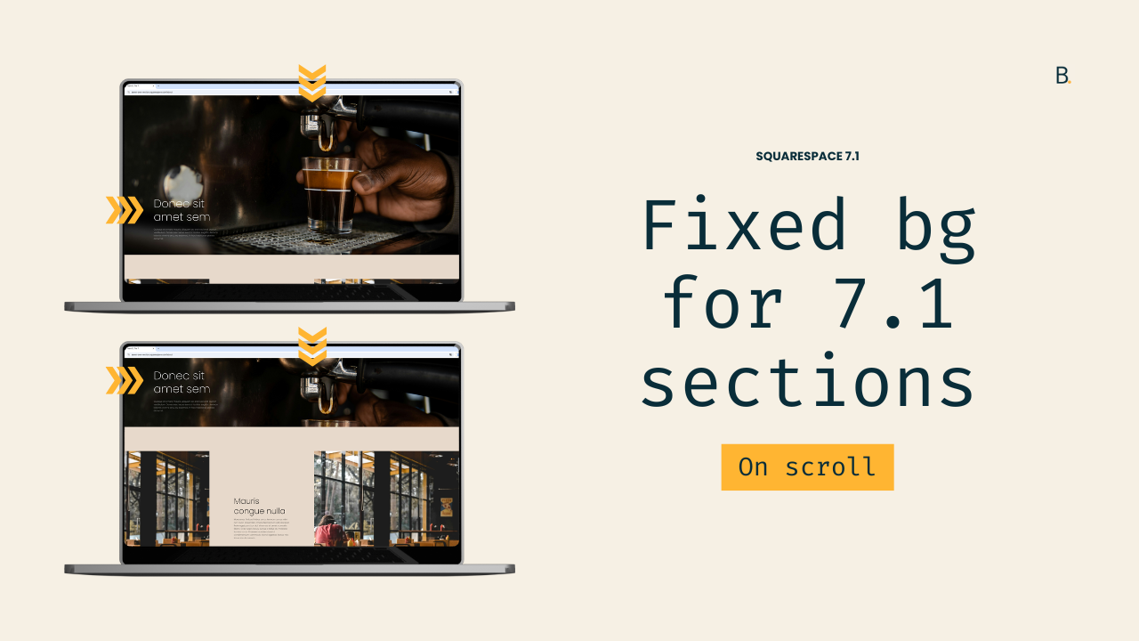
Fixed background image effect for sections in Squarespace 7.1 (aka, Parallax)
How to fix background images to Squarespace sections (Parallax)?
This tutorial walks through how to create a true fixed-background parallax effect in Squarespace 7.1 using CSS only. Unlike Squarespace’s native parallax option — which simply slows background movement — this method keeps images completely pinned while the page content scrolls over them.
Because Squarespace section backgrounds are rendered as elements, the background-attachment: fixed property can’t be applied directly. To work around this, we hide the original image and reintroduce it as a CSS background-image applied to the existing .section-background container.
Sections are targeted using anchor links to avoid relying on data-section-id values, and images are loaded from the Custom Files area. The tutorial also covers how to reuse and condense the CSS when applying the effect to multiple sections, keeping the code clean and scalable.
The result is a smooth, fully fixed parallax effect that works on both desktop and mobile without JavaScript.
A question inside The Club inspired me to create today’s tutorial.
So, if you too want to pin section images in place as the rest of the content scrolls over them, here’s what I’d suggest…
The method is a bit manual – because we need to set each background image via CSS – but super easy to reuse and duplicate once you have the first section set.
There IS a plugin inside The Snippet Directory that takes care of the whole thing automatically for you. It saves you tons of time if you have a larger project (or if your client will be modifying the images on their own) but, if you’re only handling a handful of sections, the manual method is probably more than enough.
So, without further ado, let’s jump into it!
Video timestamps
00:00 - Overview of the fixed background effect, how it works and what to consider
A couple of things to note about this method: 1) it’ll create a fully-pinned effect that the native 7.1 Parallax option doesn’t offer, and 2) you’ll need to re-upload each section image via CSS in order to achieve the look.
The process isn’t too crazy and we’ll be breaking it down step-by-step but, it’s something to keep in mind if you’re working with a large project with tons of sections. It may take some time to modify all of them.
01:16 - Setting up the images in the Custom Files window and using Anchor Links
Hopping onto the backend, you’ll see that I already have the two images I want to use for my two sections already uploaded inside the Custom Files area of the site. I also created some Anchor Links for my sections, so that I don’t have to look for their data-section-ids.
Feel free to work with whatever is easier for you.
02:29 - Looking for the image element we need to hide and the container we can use as our image anchor
With everything in place, we can now jump into the code.
First, we’ll need to look at where the existing image element is located, so we can figure out how to target it to hide it. At the same time, we’ll pick the container we want to use to set our new background image via CSS.
I recommend working with the .section-background container but, feel free to test out others to see if you get a different result.
Knowing what we need to target, we’ll build our selector. We’ll make sure we narrow it down enough to only affect our first section.
04:42 - Hiding the native section image and bringing in the new one
Then, we’ll apply the opacity property to hide the image element and – coincidentally – we’ll enjoy a minute or two of technical issues.
With the image gone, we can now see the .section-background container that was holding it.
We’ll then add our Custom Files image to it through the background-image property, and apply a couple of tweaks through the size, repeat and positioning options, in order to match the look we had in the beginning.
05:51 - And now for the magic trick: background-attachment
Once we have everything in place, it’s time to create the parallax effect with the background-attachment property set to fixed.
And just like that, the browser is now pinning the image in place, while we scroll through the rest of the content.
06:15 - Repeating the same effect for the second section
We’ll reuse the exact same code to apply the customization to the second section.
This one is set to “Inset” so it’ll give us a different look but, we won’t need to make any changes to the snippet besides the Anchor Link selector.
You can choose to get creative with this. As I show you in the video, you can work with the same image that you have on a previous section to build a cool “cut-off” effect that can build some additional interest on your Squarespace projects.
07:46 - Tip on condensing the code to avoid unnecessary repetition
At this point, the effect is complete!
However, I’ll walk you through a workflow tip that can help you keep the code concise and clean, especially on those projects where you’re planning on using this trick over and over again.
It’ll allow you to avoid unnecessary code repetition.
TL;DR
This is a fully manual approach that requires setting up each section image via CSS to be able to use the background-attachment property (the key to the effect). It works great for a small number of sections – if the client doesn’t need to swap the images on their end – but, for larger projects, the plugin route may be more helpful.
To set everything up before brining in the code, upload the images for each section into the Custom Files are of the Custom CSS Window.
If you don’t want to work with data-section-ids, I recommend setting up Anchor Links for each section that’s meant to be modified.
The first step is to locate the image element within the section’s structure to be able to hide it. At the same time, we can look for which container to use as the anchor for the background image we’ll upload via code. I recommend working with the .section-background container but you can experiment with others if you prefer.
When building our selector, we need to make sure that we’re targeting the img element within the .section-background container for our chosen section. In my case, that’s #first-section.
Then, it’s a matter of hiding the image element through the opacity property, and setting our background-image property under the .section-background container.
This, alongside the repeat, position and sizing properties will bring us to the same result we had in the beginning. But now, we can use background-attachment to pin the images in place.
Once we bring that in, the effect is complete and it’s a matter of repeating the same thing for each individual section.
And there you have it!
Now you can go and pin as many background images as you want on your Squarespace projects.
Until next time,
B.
Full code
Custom CSS Window
/*FIXED BACKGROUND IMAGE EFFECT FOR SECTIONS IN SQUARESPACE 7.1*/
#first-section {
  .section-background {
    background-attachment: fixed;
    background-position: center;
    background-size: cover;

    img {
      opacity: 0;
    }
  }
}
#first-section .section-background {
  background-image: url(BACKGROUND-IMAGE.PNG);
}