
Original image size for shop product listing galleries
How to have a dynamic aspect ratio for Shop or Product page images in Squarespace
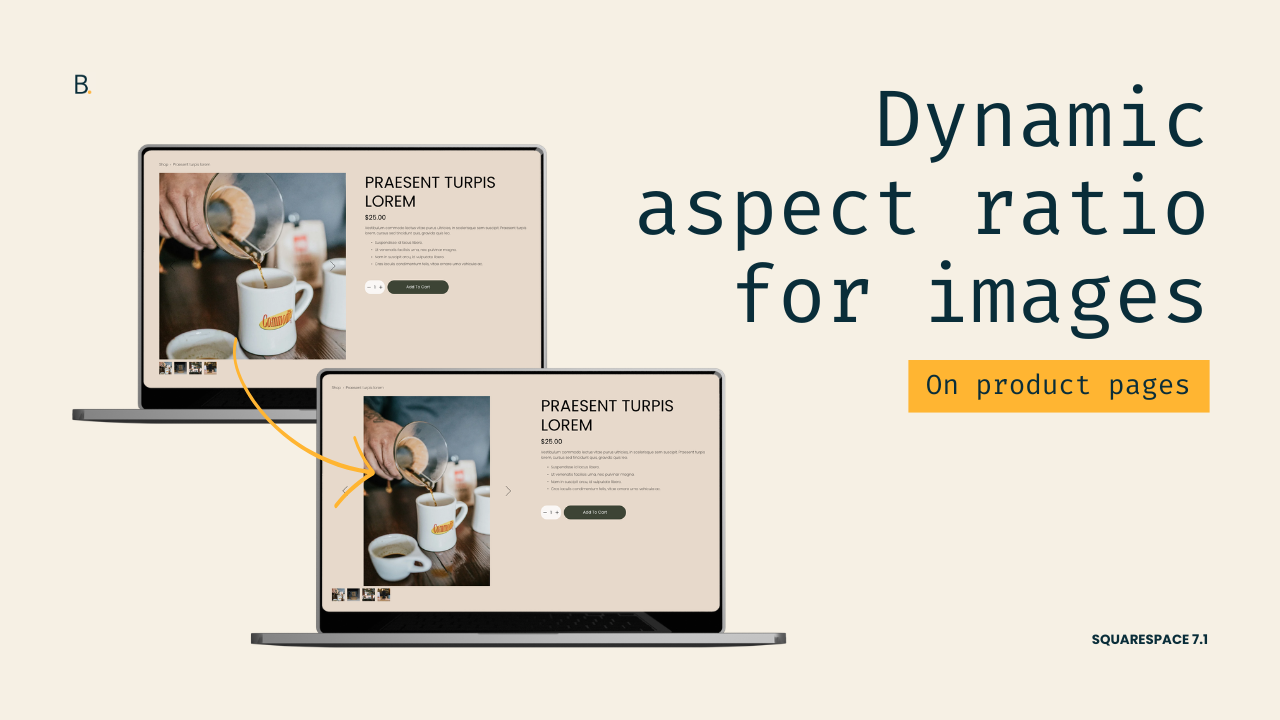
This tutorial explains how to restore the native aspect ratio of product images in Squarespace 7.1 by overriding the default object-fit: cover behavior that causes images to be cropped within fixed containers. The process involves identifying the correct image class for the specific product layout being used, such as the simple layout or half layout, and targeting it within the Custom CSS panel. By applying object-fit: contain with the !important rule, the images are resized proportionally to fit within their containers without being cut off. The solution can also be refined with media queries to control when the effect applies across different screen sizes, ensuring flexibility for both mobile and desktop experiences.
Not a fan of the cropped image look for your client’s product listings?
You’re not the only one.
In a previous tutorial, we tackled how to allow the native aspect ratio for images on the main Product/Shop page in Squarespace 7.1
Now this time around, we’ll look at how you can do it for the INDIVIDUAL listings instead.
Surprisingly, the process is even faster in this case: only 3 lines of code are necessary for both the Simple and Half layout options!
Let’s get started.
Video timestamps
00:00 - Introduction
Let me show you how you can force the native aspect ratio for shop images within individual product listings. In a previous video we saw how you can do that for the main product page, but I got a couple of questions asking how that could be done for the inner pages as well, so today that's exactly what we're going to be addressing. We're going to be implementing this on the simple layout option when the slideshow gallery is enabled and also on the half layout option. In both cases we need to do the same thing, we need to stop the image from covering its container and contain it within its boundaries instead.
00:38 - Overview of the Steps
To do this we need to take three steps. First we need to look at what the image element is called within the structure, second we need to target that inside our custom CSS window, and third we need to implement the new object-fit value. So without further ado let's go ahead and hop right into it.
00:53 - Targeting the Image Element (Simple Layout)
Now here I have my simple layout and this is the slideshow gallery that I'm working with, and I'm going to be inspecting this to locate those image elements. The actual image element that I'm seeing here on the screen, I can see that the image element is located in here and there are a couple of attributes that I can use to be able to target this via CSS. So there's this class of .product-gallery-slides-item-image, so I'm going to be grabbing that one, and then I'm going to add it into my custom CSS window. So that's already steps 1 and 2 taken care of, which is awesome.
01:28 - Changing the Object-Fit Value
And then the last step is going to be to change that object-fit value. So if we take a quick look back inside the structure you're going to see that the image here on the right side has a couple of CSS styles applied to it. One of them is this one called object-fit: cover. So this cover value is not really modifying the image aspect ratio itself, it's just forcing it to be big enough so that all of the edges of that square container get covered, hence the cover keyword. What we're going to do instead is change that object-fit to contain so that the image reduces itself enough so that either the tallest part or the widest part of the image reaches the limit of that square container, and then the other edges just go back to their native aspect ratio.
So let's go ahead and set that object-fit inside our custom CSS window, and one thing to keep in mind is that because the original value is set all the way up here where it says element.style, this means that the object-fit is currently an inline style. That just means that it's more difficult to get rid of or to alter that value via CSS. So let's just go ahead and force that object-fit: contain, we're going to be forcing that by using here the !important rule, so that is how you can handle this. You can see how it's very quick.
03:01 - Mobile and Media Queries
And now if we were to take a look here on mobile you can see how this carries on, and then we also get the native aspect ratio showing up on smaller devices. Now I did get one question asking how you could implement this only on mobile, so if you only wanted this native aspect ratio to show up in this situation then it would be a matter of wrapping all of this inside a media query of your choice. So here if I were to do that with, I don't know let's use something like 767px , if I were to use that breakpoint then you can see how the native aspect ratio shows up here for smaller devices, but then if I go back into the desktop view I still get that cover value applying, and therefore I get the 1:1 aspect ratio that the parent container has.
04:00 - Applying the Fix to the Half Layout Option
Alright so now with the half layout in place you can see that we have the slideshow showing up the same sort of cropped images as we had before. This code right now is not working, not because the approach that we need to take here is different, but because the class of the images changed. So let's go ahead and take a look at what these ones are called so that we can adapt our code and make sure that the same trick applies, or the same fix applies.
Alright so here is our image element and you can see how this one has a different class. This one is called .pdp-gallery-slides-image, so I'm going to grab that one and replace it here, and once I do you can see how now the aspect ratio, the native aspect ratio of the images, is brought back inside this half layout as well.
04:52 - Final Notes
And once more if we were to check here mobile you can see how we get those images with their native aspect ratio and we don't get the crop anymore. If you wanted to apply this only on mobile or even only on desktop, it's just a matter of adding in your corresponding media query so that you can decide at which breakpoint this change takes over.
TL;DR
Squarespace, by default, crops product listing images using the object-fit property. So, in order to “uncrop” them, we need to change that value.
First, we need to locate the <img> elements and find out what their class name is.
Then, we need to use that class inside our Custom CSS Window to target them.
And, lastly, we need to swap the current object-fit value for contain.
Additionally, if you wanted to implement this swap ONLY on certain devices, you can wrap the code with a media query and breakpoint of your choice.
That's it!
Now you know how you can keep the native aspect ratio of your shop images both on the main shop page and inside individual listings as well.
Until next time,
B.
Full code
Custom CSS Window
/*ORIGINAL IMAGE SIZE FOR SHOP PRODUCT LISTING GALLERIES*/
//Simple layout
.product-gallery-slides-item-image {
  object-fit: contain !important;
}

//Half layout
.pdp-gallery-slides-image {
  object-fit: contain !important;
}