
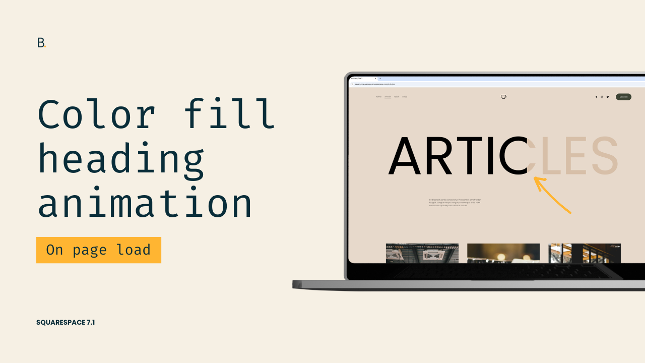
Color fill effect for headings in Squarespace 7.1
How to animate the font color of text in Squarespace
This tutorial explains how to create a color fill animation for text in Squarespace using only CSS. The effect is built by creating a two-color gradient with a sharp split, then expanding it using background-size so each color can fully cover the text. The gradient is clipped into the text using background-clip and made visible by setting the text fill color to transparent. Finally, the animation is created using keyframes that shift the background-position from one side to the other, allowing one color to transition smoothly into the next.
Want to create a sleek color fill animation for your text in Squarespace with CSS?
I gotchu.
In this tutorial, we’ll see how a smooth, eye-catching text color animation can be built in a few minutes, using a couple of lines of code.
We’ll walk through how to create and control a background gradient, clip it into your text, and animate it so one color seamlessly fills into another.
From there, you’ll be able to adapt the animation as much as you like to meet your project’s needs!
Let’s get started.
Video timestamps
00:00 — Intro
Let me show you how you can achieve this color fill animation for text in Squarespace just with CSS.
In order to achieve this we need to do three things: we need to create a background gradient, we need to set the background gradient as the color of the text, and then we need to animate that gradient so that it shifts from one color to the next.
So let's go ahead and get started.
00:21 — Setting Up the Gradient
I'm going to be using an h1 as my example but feel free to use any other type of heading that you like. Now the first thing we need to do is create the gradient.
In order to do this we're going to be using three different background properties: the first one is going to be background-image and with this we're going to be creating the gradient itself.
Now because I want to have a vertical division between one color and the other, I'm going to be setting this to 90 degrees, then the first color I'm going to be using is black, just like the color of the font, and then the second one is going to be a dark tan color.
And now, because I don't really want this to look as a gradient – I want it to be a solid division between both colors – I'm going to be using a little trick: I'm going to set the end point of the first color as the same starting point for the second color.
So what that's going to look like is 50% and 50% so that the black color goes from 0% all the way up to 50% of the container, and then the second color starts at that same 50% line and then goes all the way out to 100% of the container.
01:40 — Understanding the Animation Logic
Now before we implement the other two properties that we need to finalize the gradient, I want to explain what the logic is behind the animation.
So the goal is to have one of these colors to cover the entirety of the heading on page load and then, after a certain time passes, the second color is going to take over and it's going to cover the whole text as well.
Now as you can see on the screen right now I only have half of the text in one color and half of the text in another color. This is because the background size default is 100%.
So what we're going to do is we're going to make that gradient bigger than the text itself. We're actually going to make it twice as big because we have two colors and we want each of the colors to be 100% of the heading. We’ll do this through the background-size property, setting that to 200%.
Now right now it looks like the whole gradient turned black. But what really happened is that now that 50% of the gradient is 100% of the heading, and then we have another 50% which is outside of view that is the dark tan color and it's also 100% of the heading.
So we have 100% black and 100% dark tan. And to be able to shift between one color or the other we're going to be using background-position.
02:56 — Setting the Initial Position
So let's go ahead and implement that next. We're going to decide which side is going to be our initial color.
In my case, I want the dark tan color to be the first one we see so I'm going to switch the default position of left for right. So if I use in here the keyword of right you're going to see how now we have the dark tan half of the gradient, and the black half is all the way out towards the left side of the screen where we cannot see it.
03:23 — Clipping the Gradient Into Text
Okay, so with this in place now that we know how it works, how everything moves, and where everything is located, we can go ahead and just clip this into the text.
To do this we need two more properties. The first one is going to be background-clip and we're going to set this one to text.
As the word state this is pretty much going to clip the background into the text.
Now the problem is that I'm seeing this as black not because my gradient moved but because I haven't removed the actual font color that this element has.
In order to remove that, we need the second property. So this one has a little prefix here of -webkit- there we go and then we have text-fill-color and we're going to set this one to transparent.
So what this is going to do is remove the color of the font and allow us to see the background that we just clipped to the text.
04:20 — Creating the Animation
And with all of this in place all that's left to do is create the animation.
We're going to be using @keyframes for that and we're going to give our animation a name. It can be anything that you want I'm just gonna call this one fill.
Now for this specific animation we only need to have one step which is going to be the final one. We can either use 100% to target that last step of the animation or we can simply use the keyword to.
Then it's just a matter of modifying the alignment of the gradient. So, if I'm starting with the background-position of right I want this to animate towards the left and so basically I'm going to have the dark tan moving towards this side and then the black color is going to come in.
So let's set that up here background-position: left.
05:13 — Applying the Animation to the Heading
And now to be able to link our h1 with the animation we need to bring in the animation property here at the top. First we need to call out the actual animation we want to use which in my case is called fill.
If you use a different keyword just make sure to change it here too.
Then we need to set up the timing of the animation so the amount of time that's going to pass between one color shift and the next. I wanna keep this fairly fast so let's make it maybe like 1.3s, something like that.
Now the next thing here – and this is important – is to set the direction of the animation because I don't want this to go back and forth into the initial state again. I want the final state to stick I'm going to be using the keyword of forwards.
Last but not least we need to set the delay. This is going to be the time that the animation is going to wait after page load before it runs. I'm going to be setting this to something like 1s and then we're going to test things out.
06:15 — Testing the Animation
You can see here automatically that after I disable and enable the animation I see it running again so you don't really need to refresh the page every time to see what the final result is going to look like.
Now let's go ahead and take a look at the Live site, refresh this, and see what people are going to see.
So there you go we have that h1 that just waits a second and then we have the animation running.
Actually think that this is a little bit too fast. I want it to wait just a tad longer before running so let's keep this as 2s instead.
We're going to run this again and now after two seconds we can see how the whole text is going from that dark tan gradient color into the black one!
TL;DR
First, you’ll need to create a two-color gradient with a sharp split between both colors.
Then, set background-size: 200% so each color can fully cover the text.
To pick which color is the one that shows up on load, you can use background-position with the corresponding alignment.
Then, clip the gradient into the text using background-clip: text.
Remove the original font color with -webkit-text-fill-color: transparent.
And finally, animate the color transition using @keyframes and background-position!
There you go that's how you can quickly create this kind of text-color-fill animation for any heading in Squarespace.
Until next time,
B.
Full code
Custom CSS Window
/*COLOR FILL EFFECT FOR HEADINGS IN SQUARESPACE 7.1*/
h1 {
  animation: fill 1.3s forwards 2s;
  background-clip: text;
  background-image: linear-gradient(90deg, black 50%, #d7bfa8 50%);
  background-position: right;
  background-size: 200%;
  -webkit-text-fill-color: transparent;
}

@keyframes fill {
  to {
    background-position: left;
  }
}