
Why Your Content Gets Cut Off on Tablets When No Custom Code is Involved (7.1)
How to fix Squarespace section overflow issue on tablets when no code is used
This tutorial explains a native overflow issue that can occur in Squarespace 7.1 Fluid Engine sections on tablet devices. The problem is caused by large horizontal gap settings between grid columns, which remain fixed as the viewport shrinks. Eventually, the combined gap width becomes larger than the available screen space, causing content to overflow and appear cut off. By reducing the horizontal gap value to a more conservative setting, such as the default 11 pixels, the grid can fit properly within the viewport and the overflow issue is resolved without requiring any custom code.
Mysterious tablet overflow.
That was the working title I used when creating today’s video assets because it’s such a sneaky problem.
It’s understandable when custom code is causing it, but having it come up just by a specific section setting?… that’s another headache level.
In any case, here’s how you can quickly tackle it in a couple of clicks!
Video timestamps
00:00 - When This Issue Shows Up
Alright, let's take a look at what is going on with this weird overflow issue in Squarespace 7.1.
This one happens when you're working with Fluid Engine sections, you're looking at them on tablets, and you may not even have code applied to that section at all.
What's happening here is a native issue. However, it only appears when you're using a specific setting in a certain way.
Luckily, the fix for it is very simple and doesn't require a code at all, so let me show you first what is going on.
00:28 - A Wild Overflow Appeared
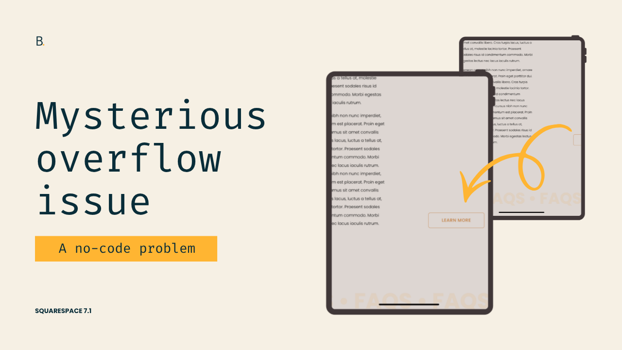
So here, I have the site that I'm looking at on tablet view, and you can already see that there's a problem here.
So here on the side, I have a button, and on this specific view, and a little bit further down, that button gets completely cut off from the section.
In the past, this overflow would be easier to see because there would be a horizontal scrollbar. However, with one of the latest updates, the content is now simply getting chopped off, so that can help hide the problem a little bit, but it doesn't really solve the issue.
I wanna show you how you can actually fix it.
01:02 - Inspecting the Fluid Engine Grid
Now, if we take a look inside this section, you're going to see something kind of weird going on.
If I stand on the Fluid Engine container, which is the one that creates the grid where all of the items are going to be sitting in, you can see that this one is pretty much populated by a lot of purple space.
The purple space represents actual space, like blank space or gaps that we have inside the grid.
So if we were to compare this to another section down here that doesn't have that issue, you can see how the container in this section does allow us to see the content areas, which is the little blue squares that we see representing the cells of the grid.
So, the difference between how I have this section set up and this section at the top set up has to do with the gap of the section, the gap value that I'm using through the settings.
01:55 - Understanding the Cause
If I take a look over here, you're going to see that right now I have my horizontal gap set to 50 pixels.
That means that between each of the columns, I have 50 pixels of space.
The problem is that when the screen shrinks down, those 50 pixels remain in place. What stretches out or reduces in size is the content area for each of the columns.
So at some point, those 50 pixels are going to add up to something larger than the screen that you're using to look at the website, and that is exactly what is going on in this example.
Those 50 pixels are creating a container that is too big to fit within this 831 pixel wide viewport, so therefore it's creating an overflow.
02:40 - Fixing the Overflow
So as you can imagine, the way to fix this is to modify the value of the gap.
If we go back and we keep this as 11, which is the default, or maybe something a little bit bigger, I actually don't like to go beyond 15 pixels because that (usually) starts creating the problem.
So I usually just stick with the native 11 pixel width, and once we have that there and refresh the page, so now we can see that even when the content is super narrow, because of the way that the grid works on tablets, we can see the button that we have here on the right side.
And then of course, if we were to inspect the grid itself, we can see the actual cells that are part of the section, and the gaps are no longer occupying the whole screen.
TL;DR
If your content is getting cut off on tablets in Squarespace 7.1, custom code may not be the cause.
This is a native Fluid Engine behavior related to horizontal grid gaps.
Large gap values stay fixed as the screen gets smaller.
The grid columns shrink, but the gaps don't, which can create horizontal overflow on tablets.
Recent Squarespace updates hide the overflow by clipping content instead of showing a scrollbar.
But to get rid of the problem completely, sticking close to the default 11px gap (or staying under 15px) is the way to go.
Hoping you found this trick helpful!
Until next time,
B.